Rumpus
Rumpus
Making virtual team meetings more collaborative with simultaneous screen sharing and non-verbal feedback.
Making virtual team meetings more collaborative with simultaneous screen sharing and non-verbal feedback.
Background
Background
Through its Mezzanine meeting room system and custom work, Oblong has always created experiences for physical spaces. Of course, collaboration doesn’t always happen in physical spaces, and we were becoming increasingly aware of that fact. We’d designed solutions for connecting multiple meeting rooms together to share a Mezzanine workspace as well as a cloud service that allowed people who weren’t in a meeting room to join a Mezzanine meeting. But what about the growing number of people who need to collaborate but will never (or almost never) be in a physical space together?
We were curious about bringing some of the most successful aspects of Mezzanine to remote teams.
Goal
Build a new product that helps remote teams collaborate beyond what they get today through video conferencing alone.
Formative research
From the beginning of the project, I was very eager to learn more about our target audience and their attitudes, behaviors, and needs. On the other hand, the stakeholders were very eager to get started building product right away. Balancing our need for speed with my dedication to user centered design, I pushed hard to get some time for formative research and soon everyone was on board!
I did secondary research on remote work and started planning a user research study to help our team understand the tools, processes, communication habits, and pain points of remote workers.
To engage the project stakeholders, I created a user interview guide that would allow them to conduct interviews too. Having an engaged group of stakeholders from the beginning helped a lot with analysis and a shared ownership of research findings.
Based on secondary research and a hypothesis that remote product teams would be highly collaborative and open to new tools, I recruited interviewees who worked on remote or semi-remote product teams.
After we conducted the interviews, I led our group of stakeholders from the Product and Design teams in an affinity mapping session to find patterns in our data. Some of our findings surprised us.
Our main takeaways:
- Many remote workers feel disconnected from their teammates and miss the “watercooler talk” that happens naturally in an office.
- A surprising number of remote teams don’t turn on video when they’re on a call. Some cited bandwidth issues, but many simply found video invasive when they’re working from a personal space like their own homes.
- Remote meetings, especially those without video, suffer from awkward silences and more awkward verbal collisions. Meeting hosts felt a responsibility to manage this, but they still felt it led to quieter team members having less of a voice than in a traditional office setting.
- Sharing content during remote meetings often meant either having one person drive for the whole session or constantly “passing the ball.”
Design sprint
After reviewing our research findings and talking about the opportunity for a new product that addressed remote worker pain points, we felt like there was something there. And based on some previous work we had done around a cloud service for Mezzanine meetings, we knew we could quickly get to an MVP that would allow us to test our hypothesis. To build on our momentum and start designing the MVP, we held a design sprint.
Following the Google Ventures design sprint process, we set a long-term goal for our product and got to work.

We generated a lot of new ideas for our product, then converged on what we wanted to test in our prototype for the final day of the design sprint.
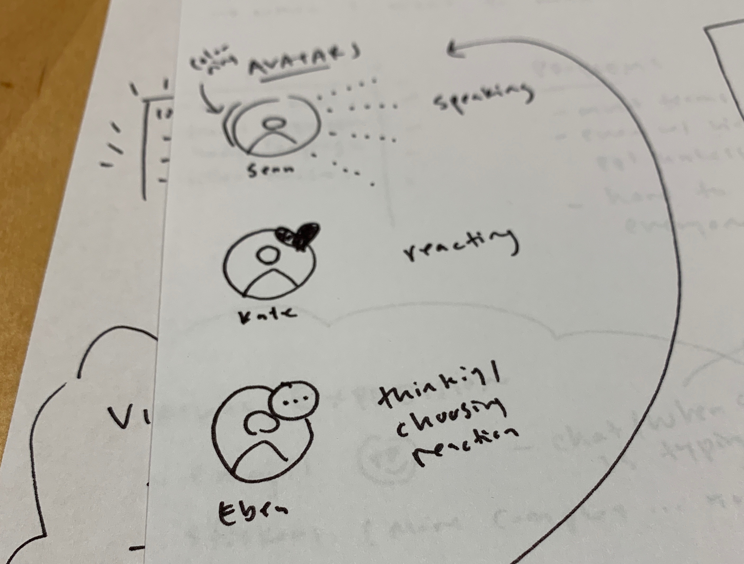
Here are the main ideas we prototyped:
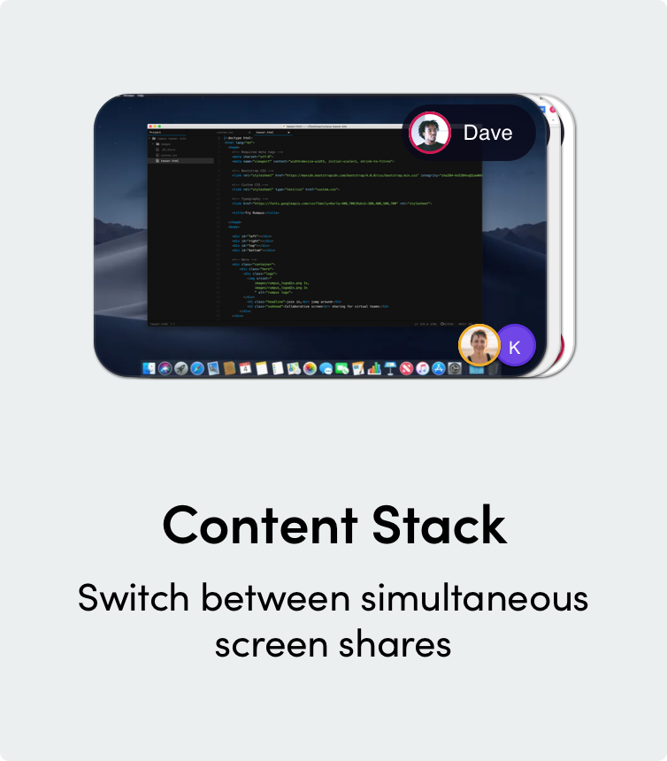
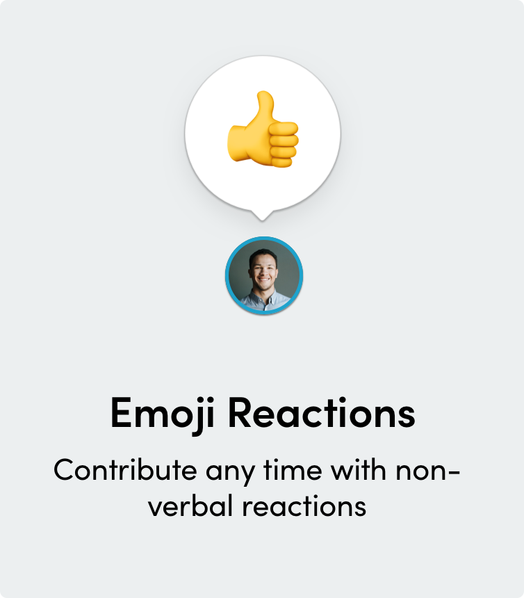
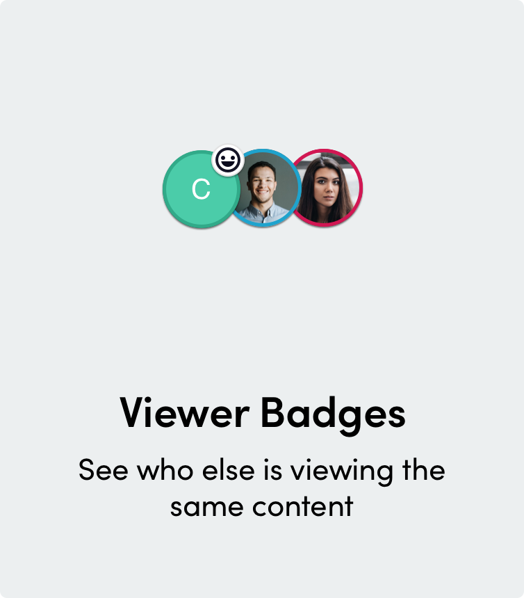
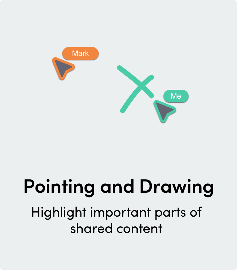
On Friday of our design sprint I ran usability testing sessions on our prototype with 5 participants who worked on remote or semi-remote product teams. The results were generally good.
- Participants liked being able to contribute to the meeting any time with multi-sharing
- They found the pointing and annotation features helpful for showing exactly what they were talking about
- They found the emoji reactions “cute” — maybe not a headline feature, but something that would help them have fun with their team (and build rapport!)
Of course, there were also some things to work on:
- Some participants were concerned that meeting attendees could view content freely at any time and wanted a way to focus everyone on the same thing if necessary
- When sharing content participants lost the context of the meeting and missed collaborative features
- There were some readability issues with icons we were using
Feature development & more testing
The formative research and design sprint offered a great opportunity for us to work ahead of the development team and get a vision for Rumpus in place. Then we kicked off development in earnest, prioritizing the features we’d tested on the backlog and designing improvements based on the feedback we'd received.
Working alongside the agile development process, I worked on the following features (among others).
Sharer experience
The feedback that participants lost context when screen sharing really stuck with us, especially because it was something a lot of us experienced ourselves. We really wanted Rumpus to be different.
I designed and user tested a sharing experience that would allow the person sharing to see their colleagues in a floating video conferencing window, retain access to all the controls they had in the main Rumpus UI, see emoji reactions and annotations on top of their content while sharing, and see other shared content.
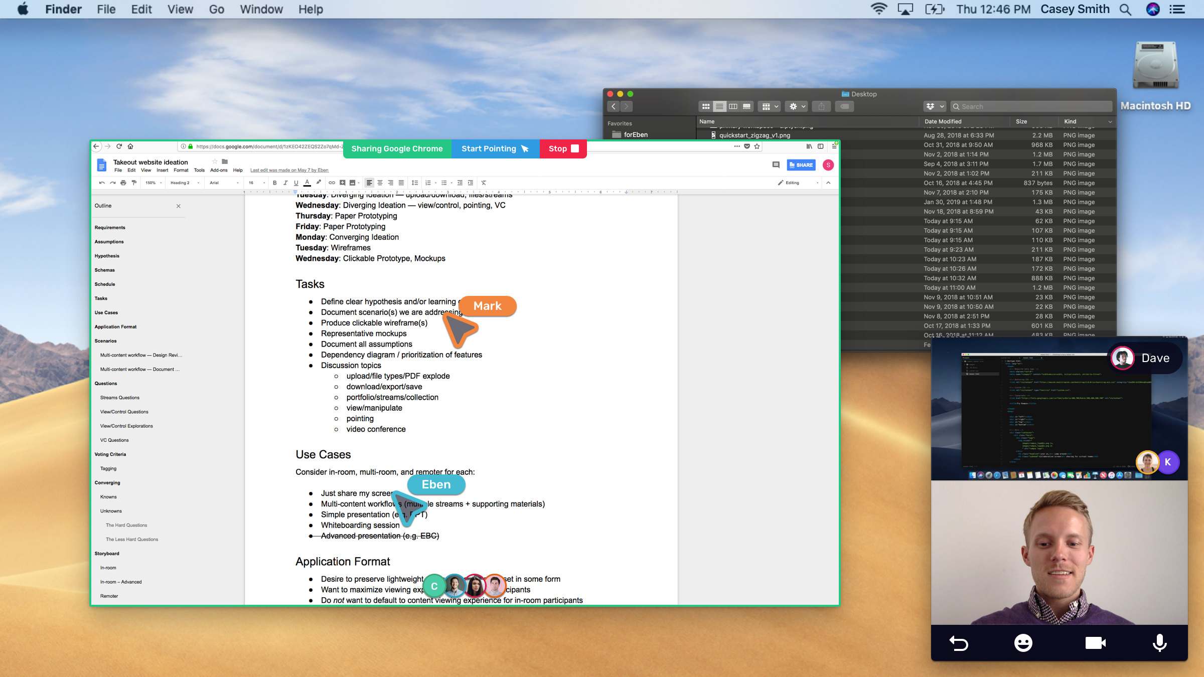
Side-by-side Rumpus and video conferencing
When we first launched Rumpus in beta, it was integrated with BlueJeans video conferencing, which created a very smooth experience for anyone with BlueJeans but also limited the pool of people who could use it.
I helped design an onboarding and meeting experience for users who didn’t have Bluejeans and wanted to use Rumpus side-by-side with another video conferencing provider.
Emoji reactions
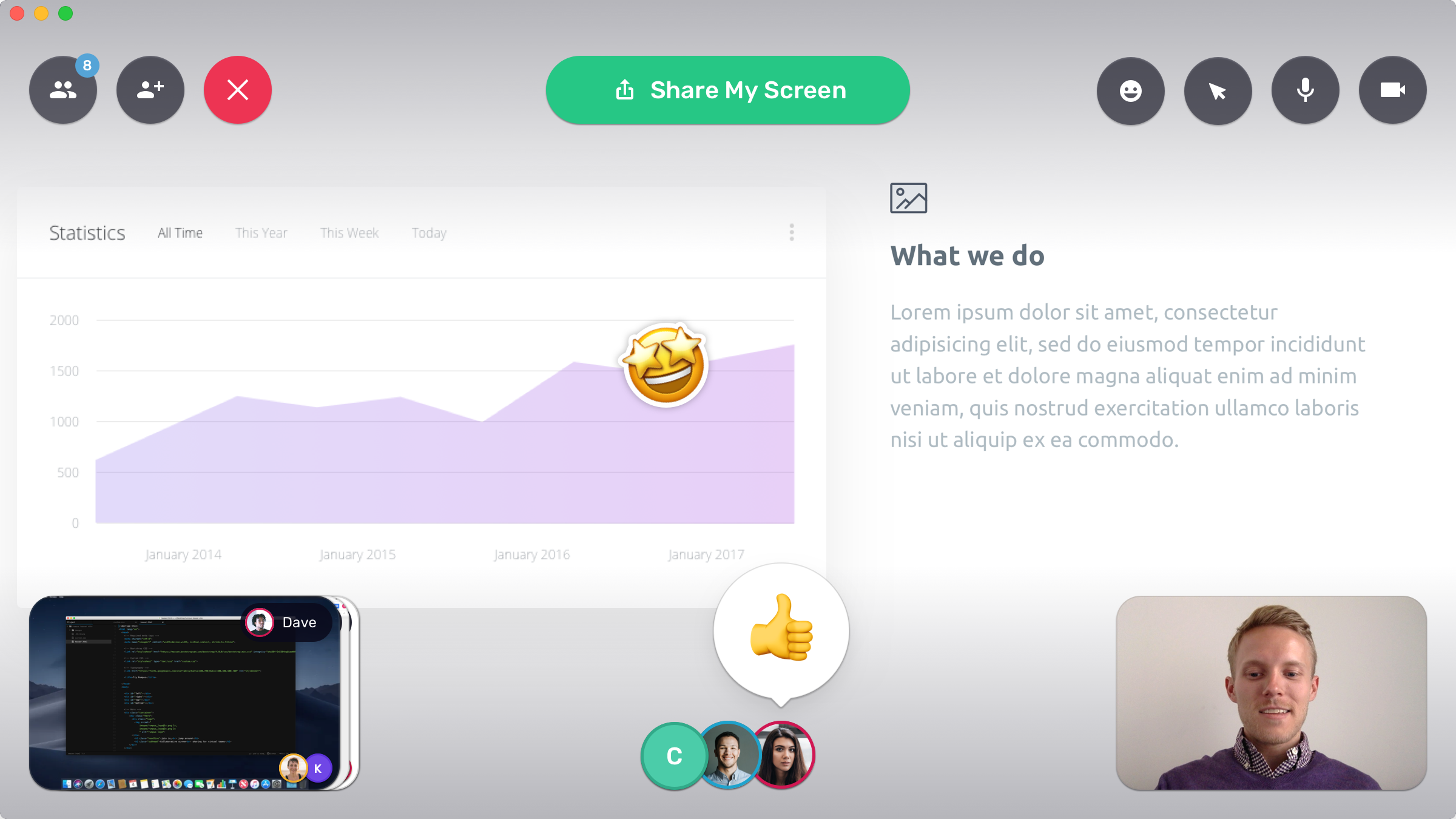
We took another pass on the emoji reactions feature while getting it ready for implementation. I helped evolve the feature to include two types of emoji reactions: real-time reactions, which pop up in real time and fade away after a brief period, and sticker reactions, which participants can drag onto shared content to react to something specific being shared.
We also moved the location of the reactions based on discoverability issues and user feedback.
Getting started experience
I conducted a set of user studies on the getting started experience, starting from the product website where participants first learned about Rumpus and moving through the download and onboarding flow. The study led to key improvements in both the product website and onboarding flow, which I helped design.
Rumpus today
I left Oblong while Rumpus was still in beta and gaining traction, but working on it from inception to implementation was a great experience and I learned a lot about what it takes to launch a new product.

