Mezzanine Mobile
Mezzanine Mobile
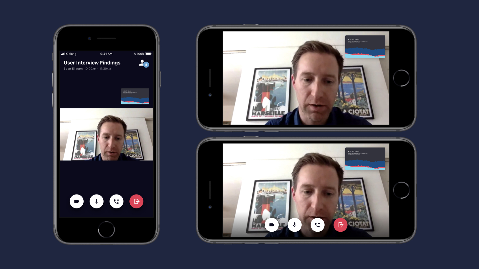
Redesigning the Mezzanine mobile app for a more context-aware mobile experience.
Redesigning the Mezzanine mobile app for a more context-aware mobile experience.
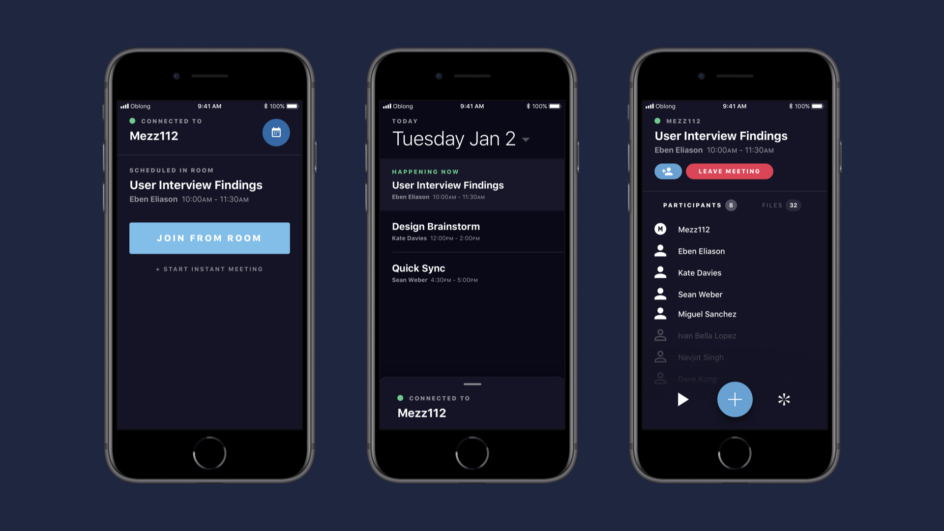
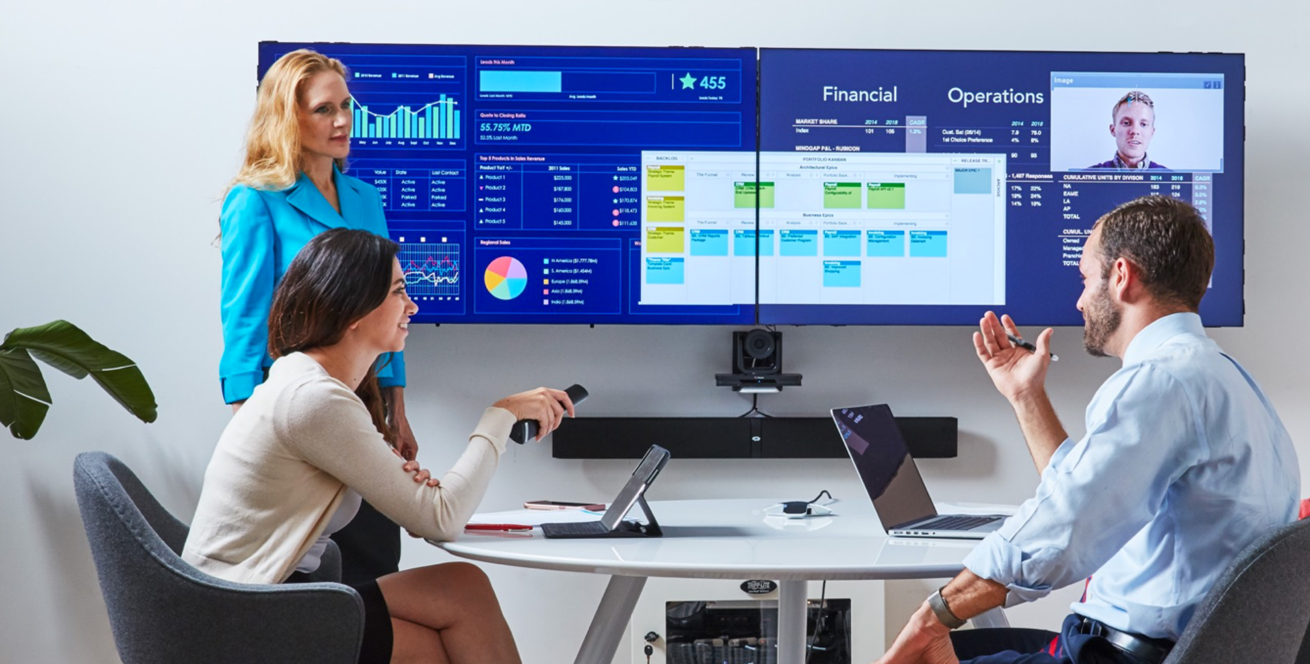
Mezzanine is a next-generation conference room system that allows meeting participants to share multiple content streams at the same time and arrange them on a flexible canvas. The system has both hardware and software components, and users can interact with it using laptops, mobile devices, and a gestural wand.
Background
The Mezzanine team occasionally took "free sprints," where team members could work on a project of their choosing for a 2 week period to take a break from regular work and explore new territory.
For one free sprint the 3-person design team decided to take on the Mezzanine mobile app. I'd worked on some new mobile features, but there hadn't been major updates recently and we all felt like it could use an overhaul.
Since the free sprint took place over the holidays and we were all taking vacation during parts of it, we had 1 week for the project.
The problem
The Mezzanine app had a lot of functionality, but it wasn't tailored to mobile — it just replicated the functionality of the Mezzanine system and web app in a smaller form factor, and a lot of that functionality was easier to do on a larger screen. Additionally, a lot of the screen real estate was taken up by replicating the content that was already visible on the large screens in the room.
We wanted to reimagine an app that took advantage of the mobile platform and was more aware of the Mezzanine ecosystem as a whole.
Use cases & tasks
Almost everyone walks into a Mezzanine meeting room with a phone in their pocket. However, most Mezzanine users also bring their laptops with them into rooms, so we wanted to focus on what makes phones different. (Because of the short timeline for the project, we decided not to include tablets.)
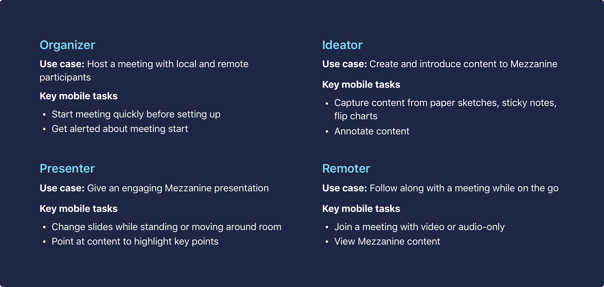
Through brainstorming and discussion, we came up with use cases and tasks where phones were uniquely capable.
Sketching & wireframes
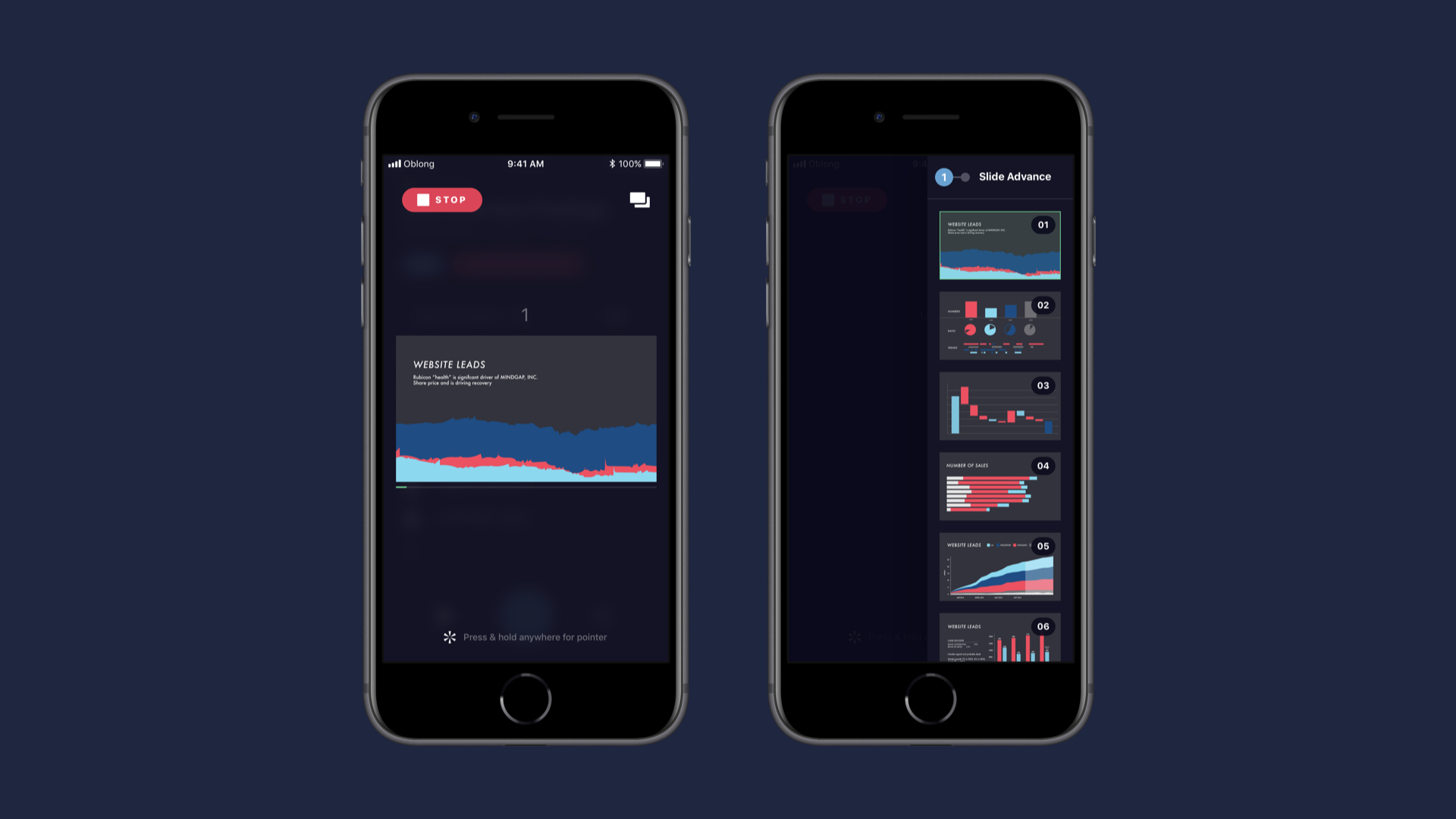
We started sketching user flows based on the use cases and tasks we'd outlined: hosting a meeting, giving a presentation, running an ideation session, and joining a meeting remotely. To maximize our collaboration time as a team, we sketched in 15-20 minute sessions and then shared our work, got feedback, and iterated on our sketches in the next session.
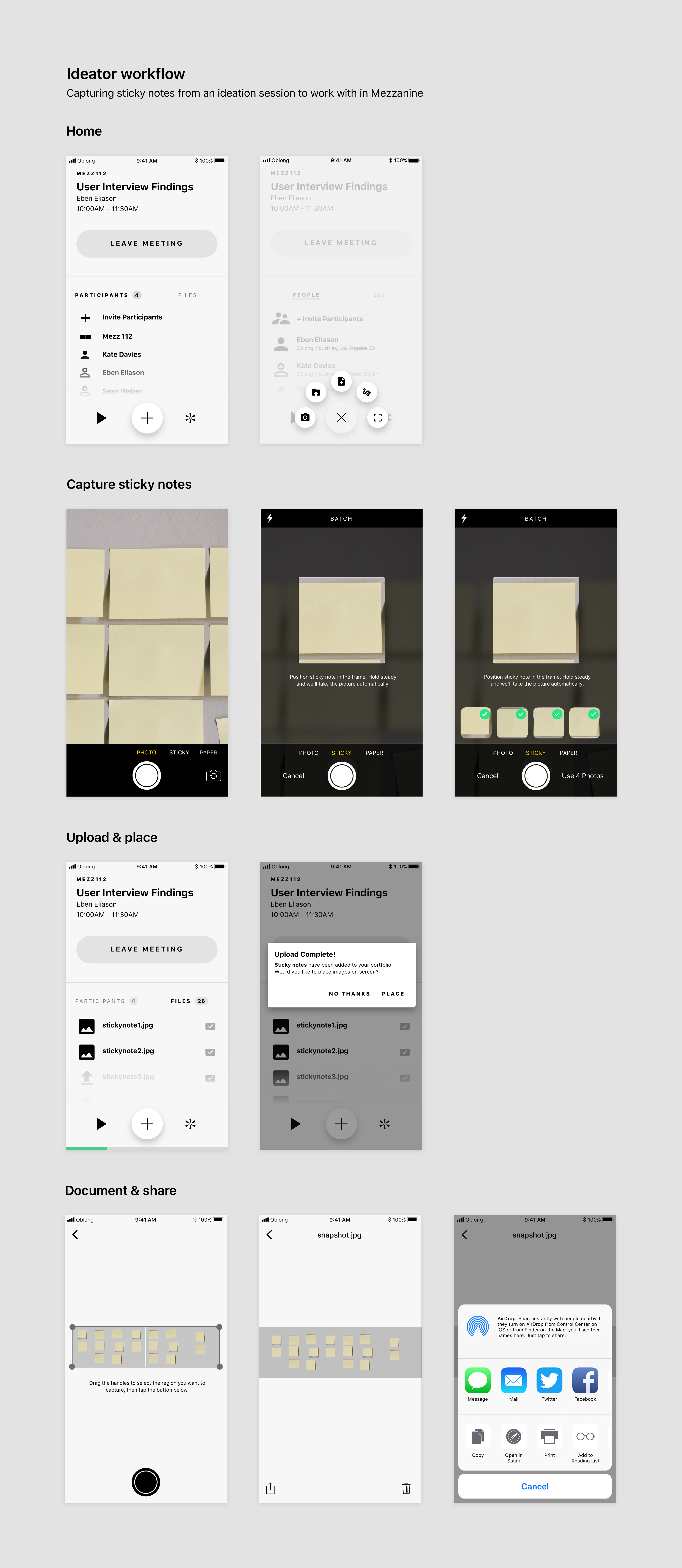
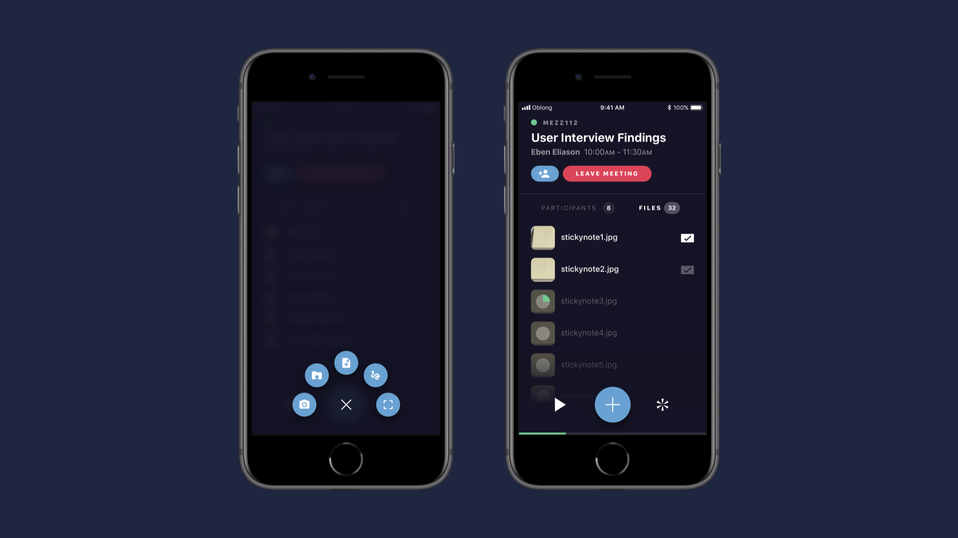
For wireframes, we decided to divide and conquer — I took the ideation flow, where I'd had the idea of allowing people to capture and upload sticky notes quickly to Mezzanine. We knew through past customer interviews (and our own habits!) that users prefer to rely mostly on analog tools for ideation but have trouble digitizing results when the project moves foward, so I was excited at the opportunity to make that process easier.
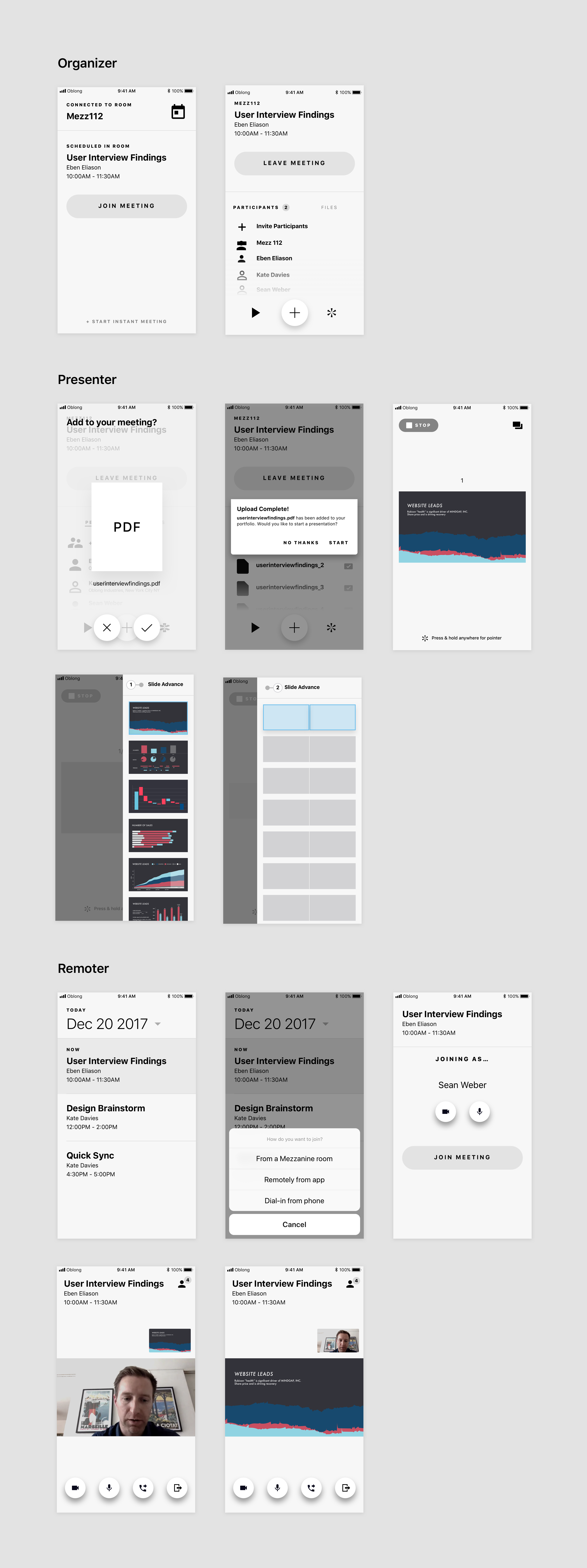
Here are some wireframes from the other flows:
Prototyping & presentation
At the end of the free sprint period we presented our work to the team. To prepare, I wrote a demo scenario that showed the mobile flows in a meeting context and put together Invision prototypes for the demo. We also presented a deck to walk teammates through our free sprint process and included high-fi mockups from our UI designer to show the app in a polished state.
We got great feedback from our team about the concept and everyone was excited to see the potential for an overhauled mobile app.
While mobile ultimately wasn't prioritized and we didn't see this work come to fruition, it was a fun project that gave us the opportunity to discuss the role of platform-specific apps in the Mezzanine ecosystem and how to utilize them better — ideas we continued exploring with the Mezzanine desktop app.
