Mezzanine
Mezzanine
Redefining the initial user experience of Mezzanine with a new, unified app for desktop.
Redefining the initial user experience of Mezzanine with a new, unified app for desktop.
About Mezzanine
Mezzanine is a next-generation conference room system that allows meeting participants to share multiple content streams at the same time and arrange them on a flexible canvas. The system has both hardware and software components, and users can interact with it using laptops, mobile devices, and a gestural wand.

Problems
By the time I started working on Mezzanine it was already a highly capable system, but the various moving parts made it difficult (and often intimidating!) for new users to get started. It was something I experienced firsthand during my first few weeks on the job and heard in conversation with our sales engineers and customer success managers: Highly experienced users loved the system and wanted more functionality, but new users found it complicated and confusing. The user research efforts I started when I joined the team made it even more clear that we had a big issue with new user experience.
These were the primary problems:
Multiple ways to get started. Mezzanine supports multiple users at a time and interaction through multiple devices. This provides a lot of flexibility, but also comes with confusion. Users can get started by using a wand to interact with the screens in the room, plugging a laptop into the system with a cable, or using a desktop, web, or mobile app.
Different apps (with different names) for different functions. Some of the primary functionality of Mezzanine was spread across different apps. There was a dedicated desktop app for wireless screen sharing (and not much else) called Screencast, and a web app for uploading content, changing the view on screen, and managing meetings, referred to as “the web client.”
Little instruction for new users. While there was some instruction about using Mezzanine on the screens in the room, different instructions highlighted the different apps and paths to getting started (e.g., use the wand, get the mobile app, plug in your laptop) and confused new users.
This all led to low engagement with Mezzanine rooms and a heavy burden on our customer success team to provide hands-on training and support.
Goals
When the design team started planning an overhaul of the user experience, we already knew that one of our goals would be to unify Mezzanine functionality in a single, feature-complete app. This would help us in our other primary goal of making it quicker and easier for new users to get started with Mezzanine.
Process
The Mezzanine team follows agile development and has a 2-week sprint, and in general the design team worked to prepare designs “just in time,” usually a sprint before implementation, to stay in sync. For larger projects that needed more vision up front, we found it helpful to block off a full sprint where we weren’t doing other design work so we could focus on ideation and create initial concept designs.
For this project, we started with one full sprint to do concept work up front, then worked back in with the team.
Project kickoff
To prepare for the project, the design team reviewed all the data we already had about the current experience, including usability studies on the initial user experience, customer interviews, and reports from our customer support team. While our primary focus was improving the experience for new users, we also knew we needed to accommodate our expert users who wanted easy access to more advanced Mezzanine functionality.
Brainstorming and sketching
We did several rounds of brainstorming over the period of a few days to get all our ideas out on the table (and all over the walls). After brainstorming we used dot voting to promote our strongest and most compelling ideas to the next round — sketching!
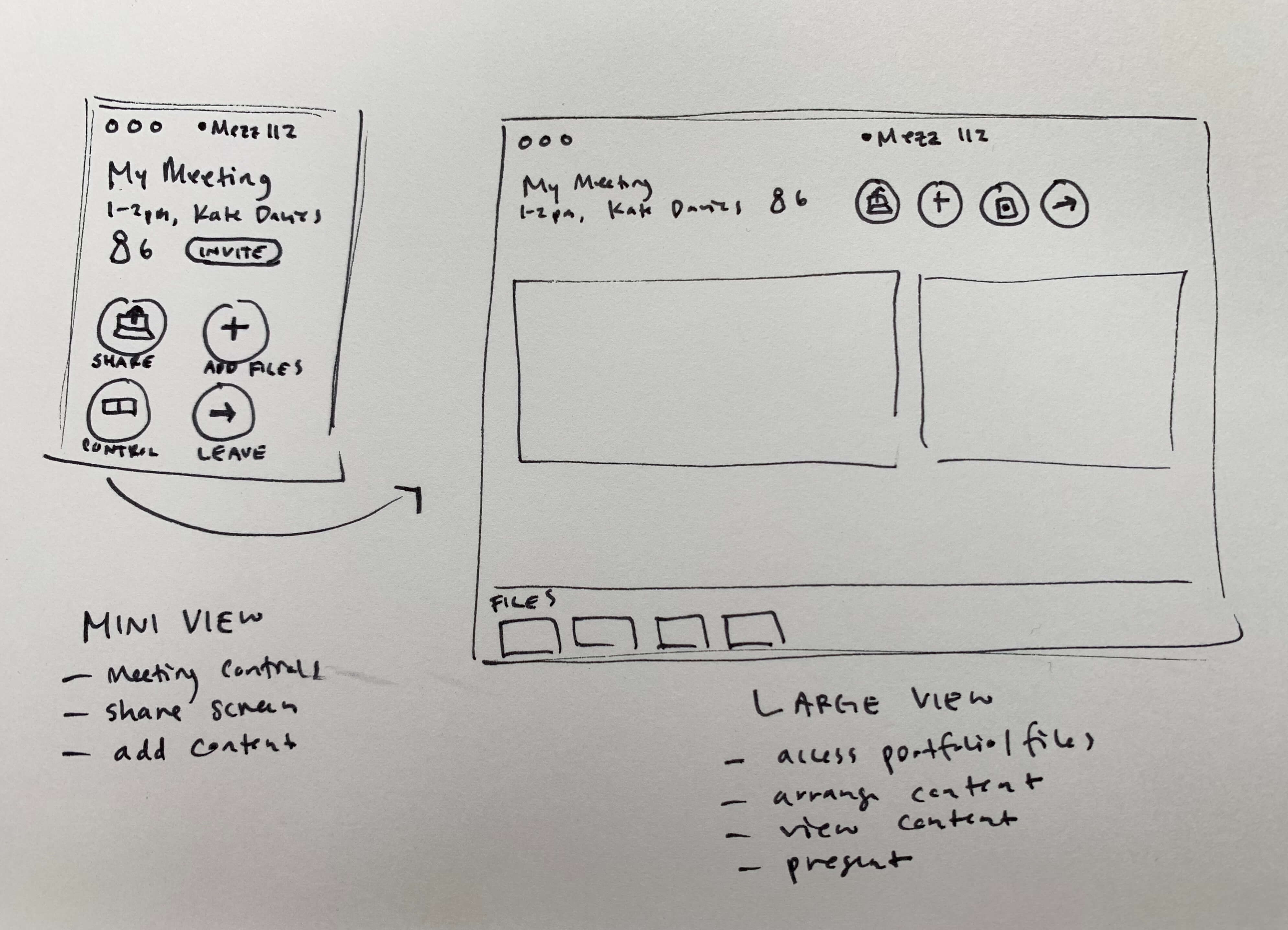
We did multiple rounds of individual sketching, where we played with different combinations of ideas and possibilities for our app. Sharing the results of the sketches between rounds helped us cross-pollinate ideas that could be reimagined by another team member in the next round of sketching.
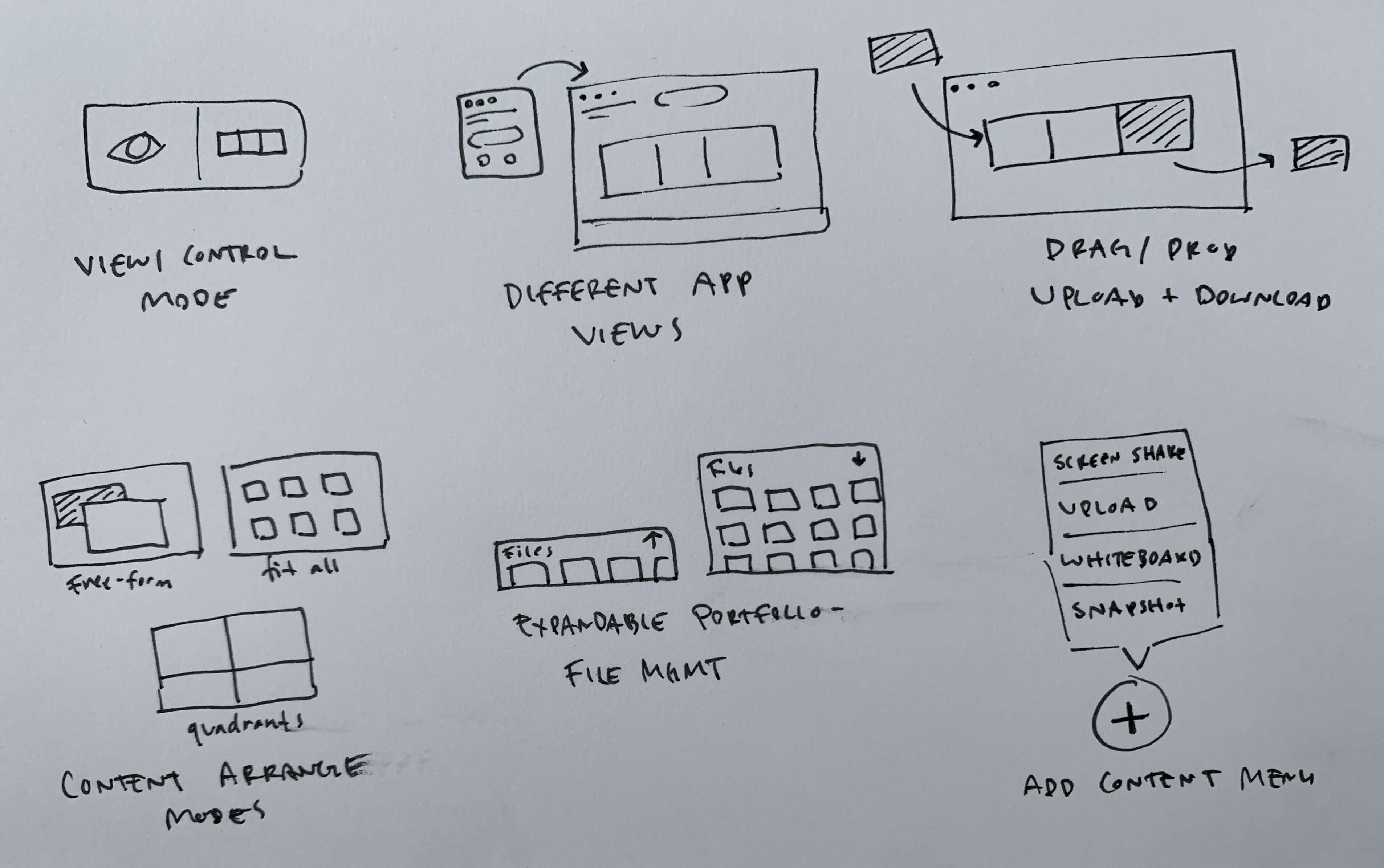
By this time we were building consensus around the idea that our app could have two views, one for basic functionality that would be easy for new users to learn, and one that exposed the more advanced functionality our experienced users rely on!
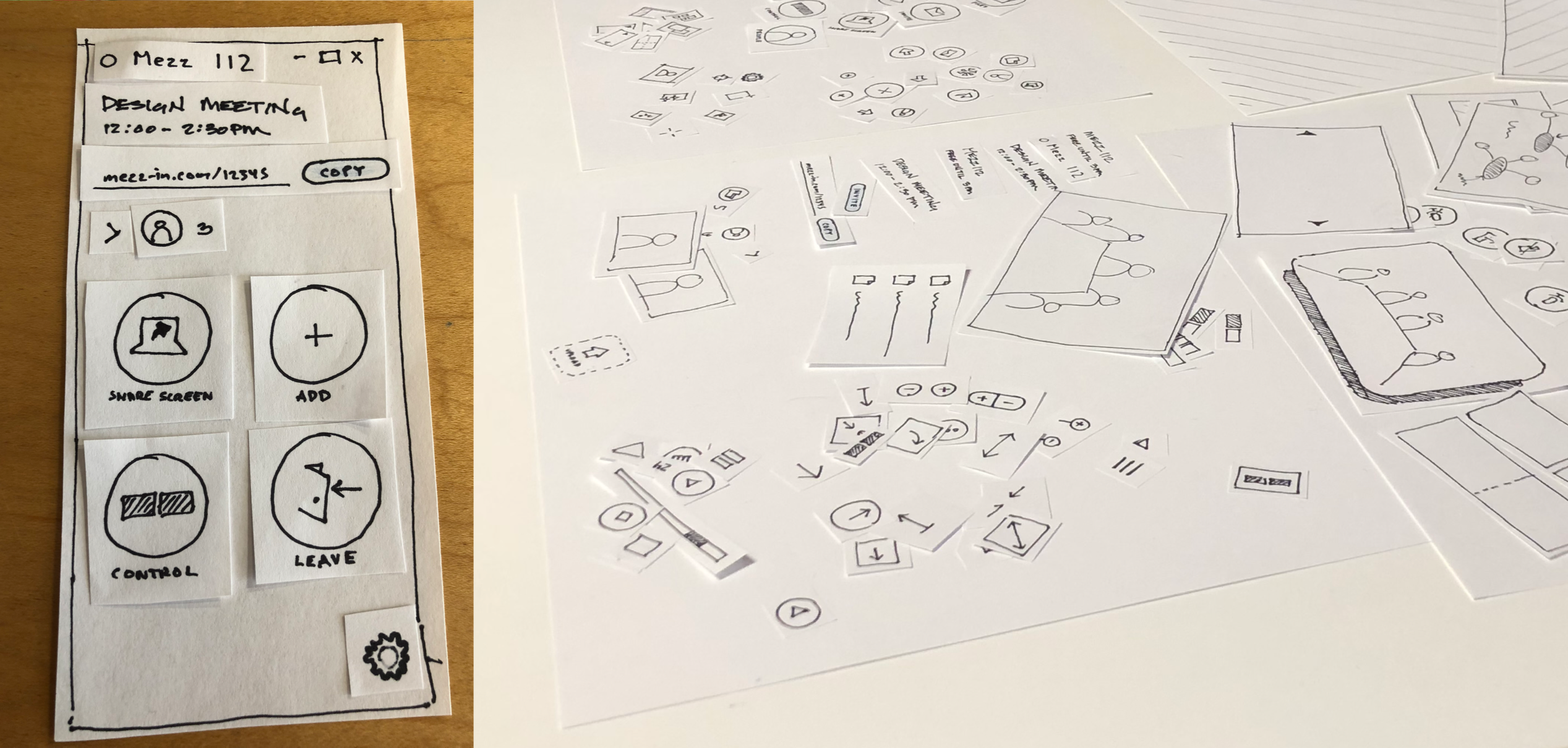
Paper prototypes
To test our central ideas quickly, we made a set of paper prototyping components that would allow us to get feedback on our two-view idea and also allow participants to design along with us by reconfiguring the components the way that made the most sense to them.
Low-fi prototypes
We took feedback from the paper prototyping stage and started creating low-fi prototypes in Invision so we could get a closer approximation to the real experience, conduct more testing, and explain our vision to project stakeholders.
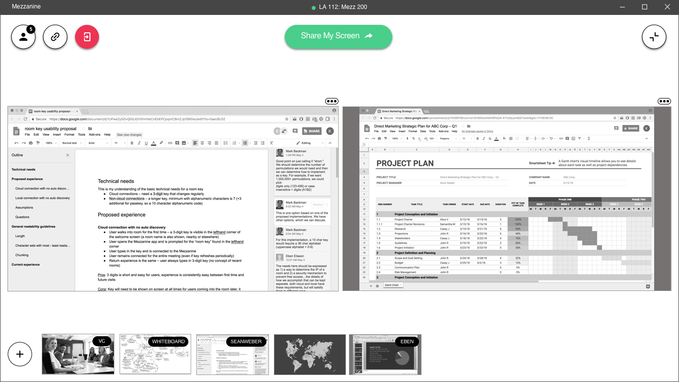
To help with pitching our vision and get the rest of the team excited, our UI designer also made some high-fi concept mockups to show what our redesigned app could look like.
Incremental changes & usability testing
At this point we were done with our sprint-long ideation and concept phase, and we did the rest of the design work “just in time” alongside the sprint teams doing the implementation. We worked closely with product owners, scrum masters, and technical leads to plan and prioritize the work so it could happen incrementally and align with our agile development process.
While our UI designer worked on visual specs for the components of our new app, I took the lead on writing detailed behavioral specs and conducting usability testing on high-fi prototypes and new implementation. Frequently testing the latest versions with external users (who were new to Mezzanine) allowed us to check our progress and iterate as we went, adapting to usability issues and technical limitations that arose. We also got feedback from current users during this time to make sure the updates would have a positive impact.
Results
The unified app of today is a far cry from the fractured landscape of Mezzanine’s past. New users who come to the room are greeted with clear messaging telling them to download the Mezzanine app to get started.
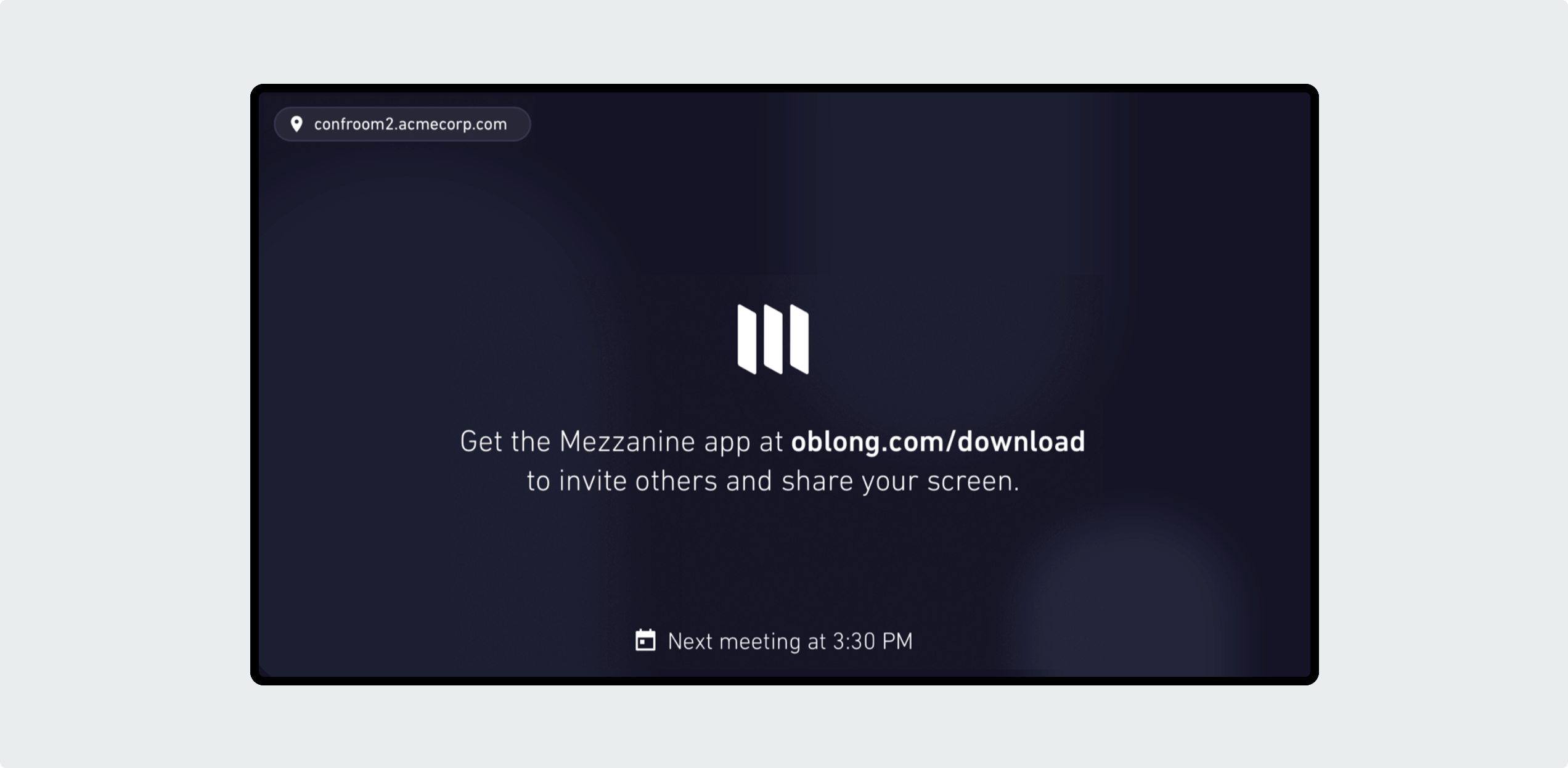
Then the app walks them through the process of connecting to the room for the first time.
A small app window offers the most essential Mezzanine functionality, screen sharing and meeting controls – this helps new users get started in a way that’s clear and unintimidating. Big, discoverable buttons help users perform actions easily without taking too much of their attention away from the meeting, and the small app window helps keep the focus on the content on the screens in the room rather than individual laptop screens.
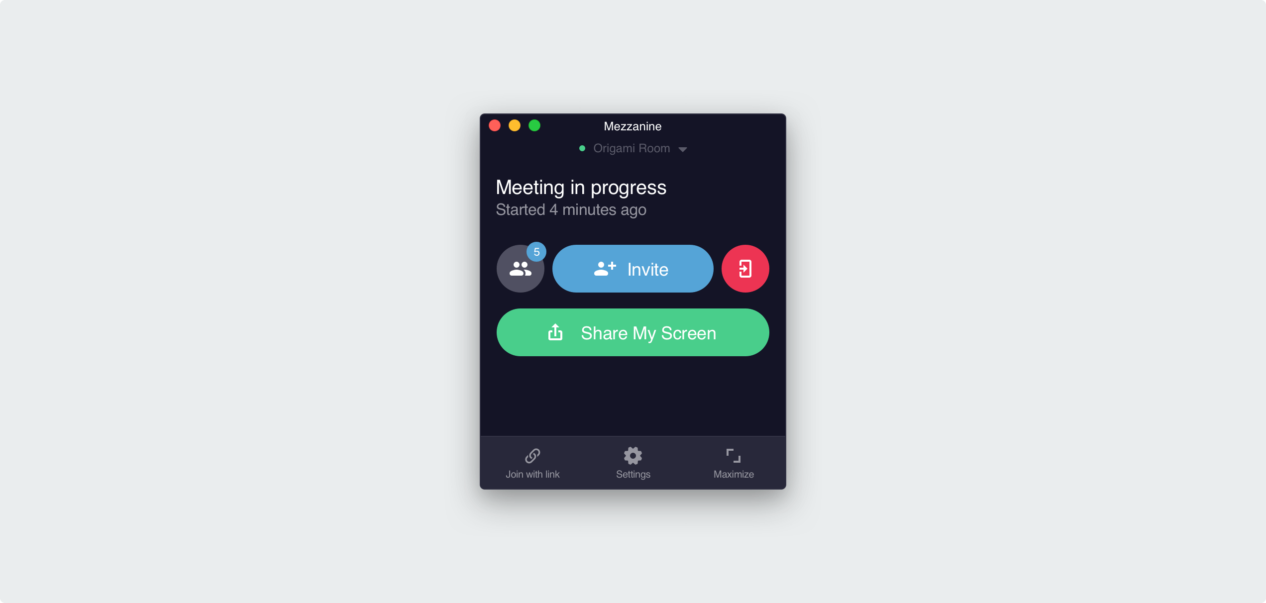
The large majority of users will only need to use the small window, but the layout view of the app holds more advanced functionality, allowing users to resize and move content, upload static content, and do an advanced presentation.

We didn’t do everything we set out to – most notably, plans to integrate Mezz-In, a cloud service that allows people who aren’t in a Mezzanine room to join a meeting, were cut from the initial launch. But having a single, focused Mezzanine app was a big step in maturing the product experience and laid the groundwork for future iteration.

