Papaya
Papaya
Driving repeat bill engagement by increasing transparency and improving user understanding
Building a consumer bill pay experience that first-time users can trust and understand
Background
Papaya is an early stage fintech startup with a mission to alleviate the stress of paying bills. It serves both sides of the bill pay market – consumers, who want to pay their bills quickly and easily, and billers, who want to maximize returns and process payments efficiently. Currently Papaya is focused on paper bills, which tend to be the most difficult and time consuming to pay, requiring users to visit a clunky payment portal, make a phone call, or even mail a check.
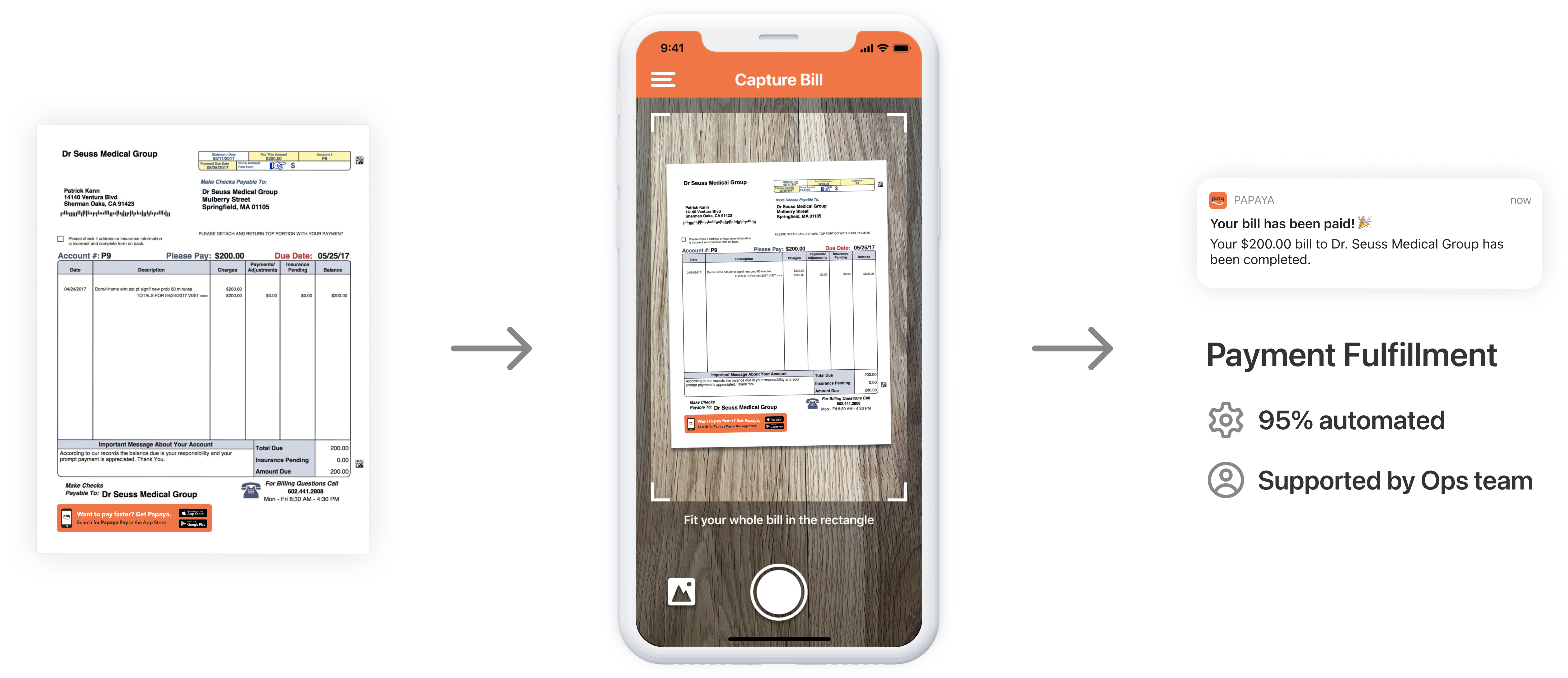
Papaya acquires users by advertising directly on bill statements. When users see the ad, they download the Papaya mobile app and take a picture of their bill. Papaya then scans the picture and uses optical character recognition (OCR) to extract payment information, which it uses to automate the bill payment. With the ability to automate payments (and a helpful Ops team to cover any tricky cases), Papaya can pay any bill users submit – even if the biller doesn’t partner with us or advertise Papaya on its statements!
Problem
Unfortunately, users don't understand that Papaya can pay any bill.
Acquiring users through bill statements is cheap and works well, but it does have some downsides. While completion rates are very high for a user’s first bill (usually a bill that advertises Papaya on the statement), the repeat usage rate lags far behind. One effect of having an ad on the statement is that users trust the app works well for that bill, but not necessarily others.
Users love the Papaya experience and many refer to it as “magic,” which sounds great at first … but if users don’t know how it works or what bills it works for, they don’t trust the process or know it's repeatable.
To reach its growth goals, Papaya needs to retain users and help them get more value out of the app with subsequent bill payments.
Goals
I worked with the Consumer iOS team to increase repeat bill engagement in the first 7 days after download, collaborating closely with the Product Manager to brainstorm ideas. Our business goals were to improve user retention, drive growth, and increase our total payment volume – one of Papaya’s key metrics.
Most importantly on the design side, I wanted to make sure users understand how Papaya works so they can feel confident when they’re paying bills with us – confident enough to want to pay again! Since users love the ease of Papaya, I also wanted to help them understand what bills they can pay so they can take full advantage of the convenience.
Part 1: Increasing transparency in the bill pay process
We knew from user interviews that bill payers didn’t understand how Papaya was able to pay their bill from just a picture. The PM and I hypothesized that users would pay more bills with us if they knew enough to have confidence in the process, so we started looking at the flow to see where we could increase transparency. We didn't want to put too much user education up front because we had recently A/B tested a lightweight onboarding that works well for our user acquisition flow. We decided to focus our attention where users have the most confusion – the bill scanning process.
Current flow
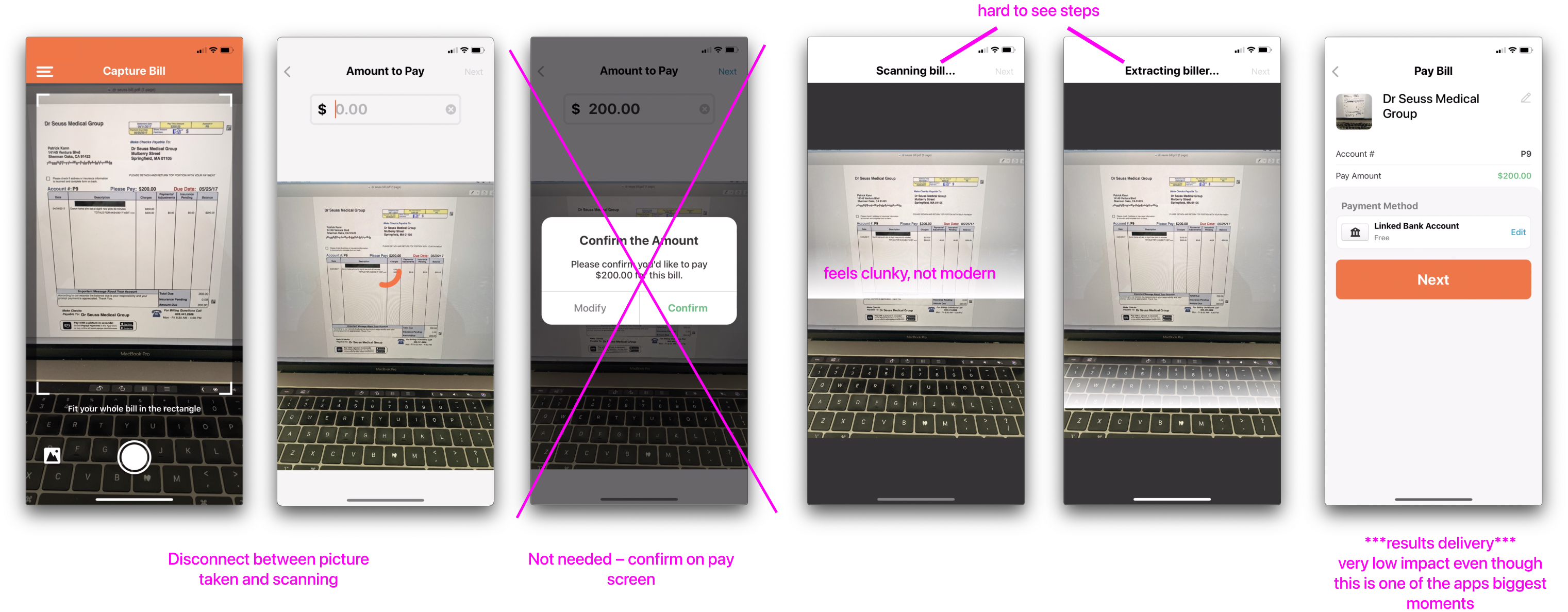
Our current scanning flow clearly wasn’t doing enough to educate users, and mapping the flow helped me see two big areas of opportunity:
- The transition from capturing a bill image to scanning. In the current flow, the user took a picture of their bill but it wasn’t clear what we were doing with it. We went right into asking the user how much they want to pay towards the bill, which obscured the scanning process.
- The transition from scanning to “ready to pay.” I’d seen in usability studies that there is a bit of an “aha” moment for some users when they see their information was successfully pulled from the bill, but the lack of transparency in the process was preventing some users from having that realization. We also don’t present results with much fanfare – there was an opportunity to make it more clear and more celebratory!
Technical constraints
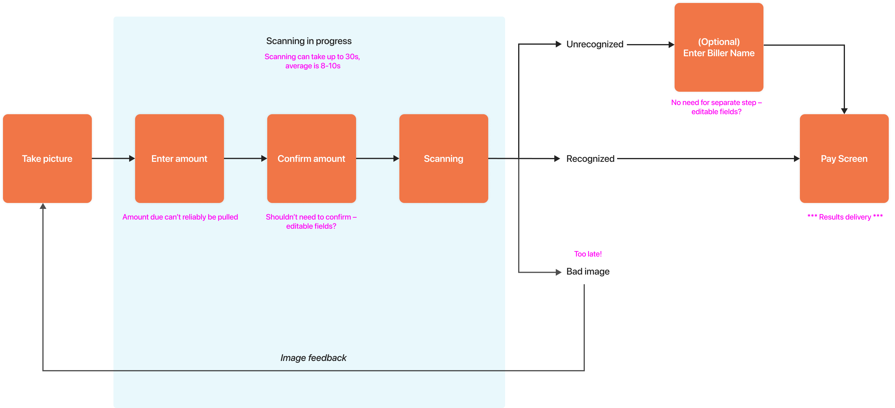
The PM and I also met with the developers who knew most about the scanning process. We were on a tight timeline to start making improvements and wanted to make sure we understood the technical constraints up front. Some key takeaways:
- The order of certain steps was fixed because of how bills are created in the backend and how we calculate fees
- The OCR process averages 9 seconds but can take up to 30s
- The OCR would return all the information it pulled at once, so we couldn’t get individual results (like biller name, account number, etc.) as they came in
Ideation
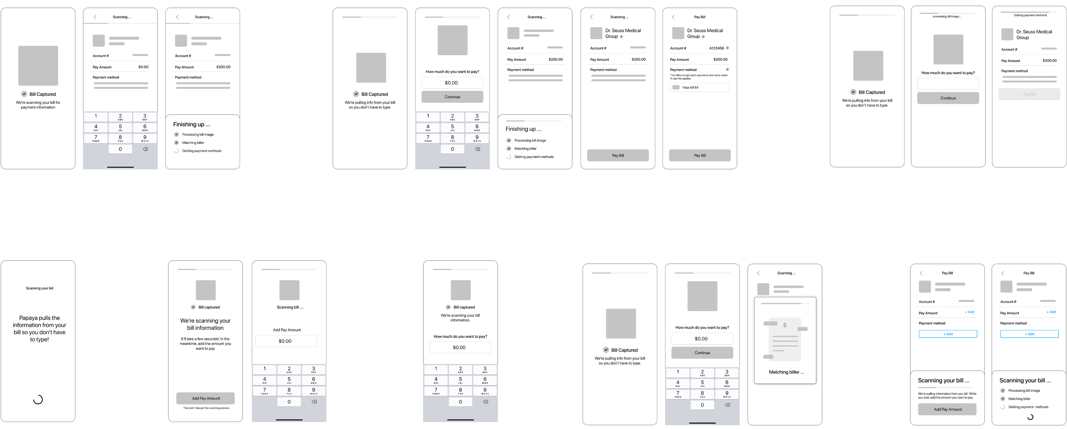
With a clearer idea of the constraints, I started sketching out ideas. I focused on the transitions from capture to scanning and from scanning to results delivery, and a lot of my ideas centered around delivering the results in the context of the Payment screen so users could directly see how the information pulled from OCR goes toward their payment. After finding out the OCR could take up to 30s I was also interested in finding ways to entertain and reassure the user if the scan took a long time. I did some competitive research on adjacent experiences that used scanning or did a good job handling long wait times.
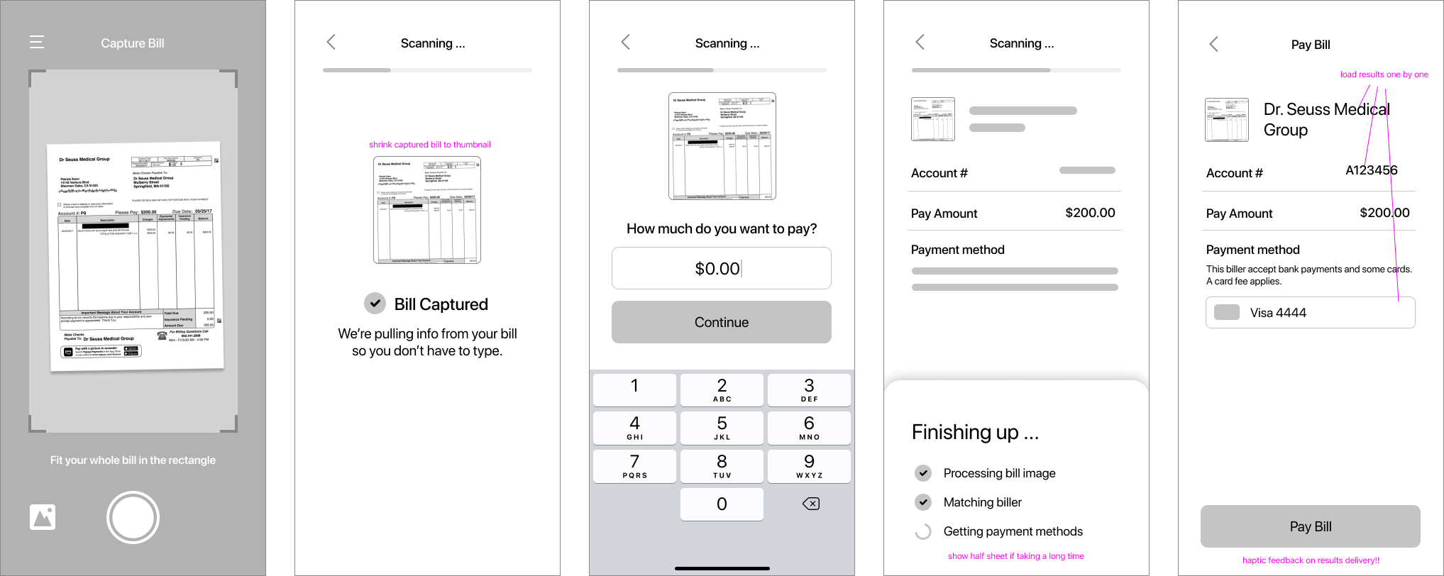
I wireframed a few different directions to share with my PM and discuss pros and cons, but we both had a clear favorite: an approach that informs the user up front that we’re scanning their bill, increasing transparency from capture to scan, entertains the user by allowing them to type in their amount to pay while waiting, then takes them to a skeleton loading version of the payment screen so they can see the results delivery in context.
High-fidelity designs
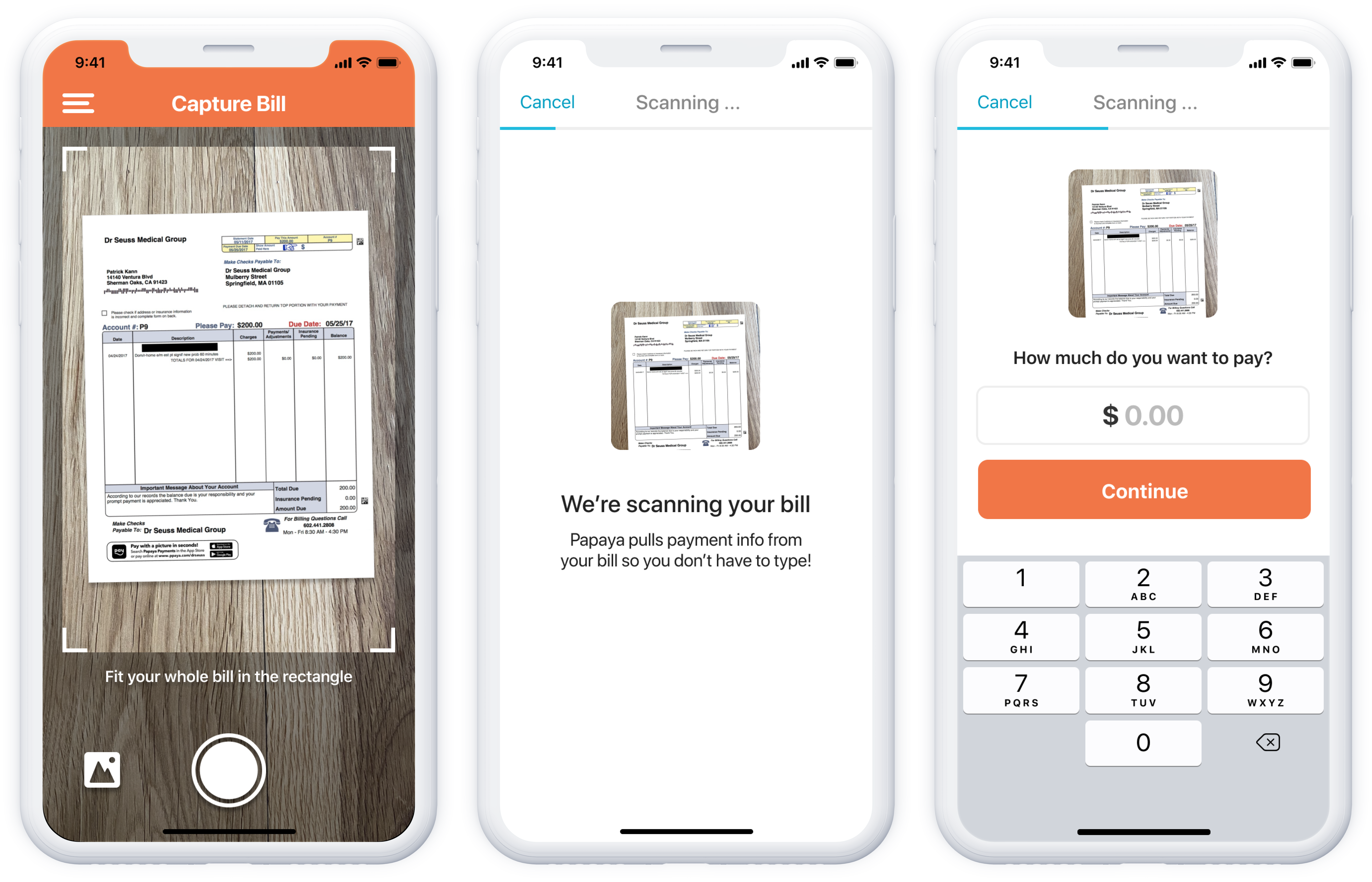
- Start scanning: After the user takes a picture of their bill, the picture shrinks into a thumbnail on the next screen, with a scanning animation over the thumbnail to help the user understand that scanning is starting. Copy reinforces the value Papaya brings with bill scanning.
- Add amount: We can’t reliably pull the amount due from the bill image, plus many users need to pay less than their bill total, so after the scan has started we auto-advance users to the next screen to put in their bill amount. This gives the user something to do and reduces the time they’ll be actively waiting for OCR results.
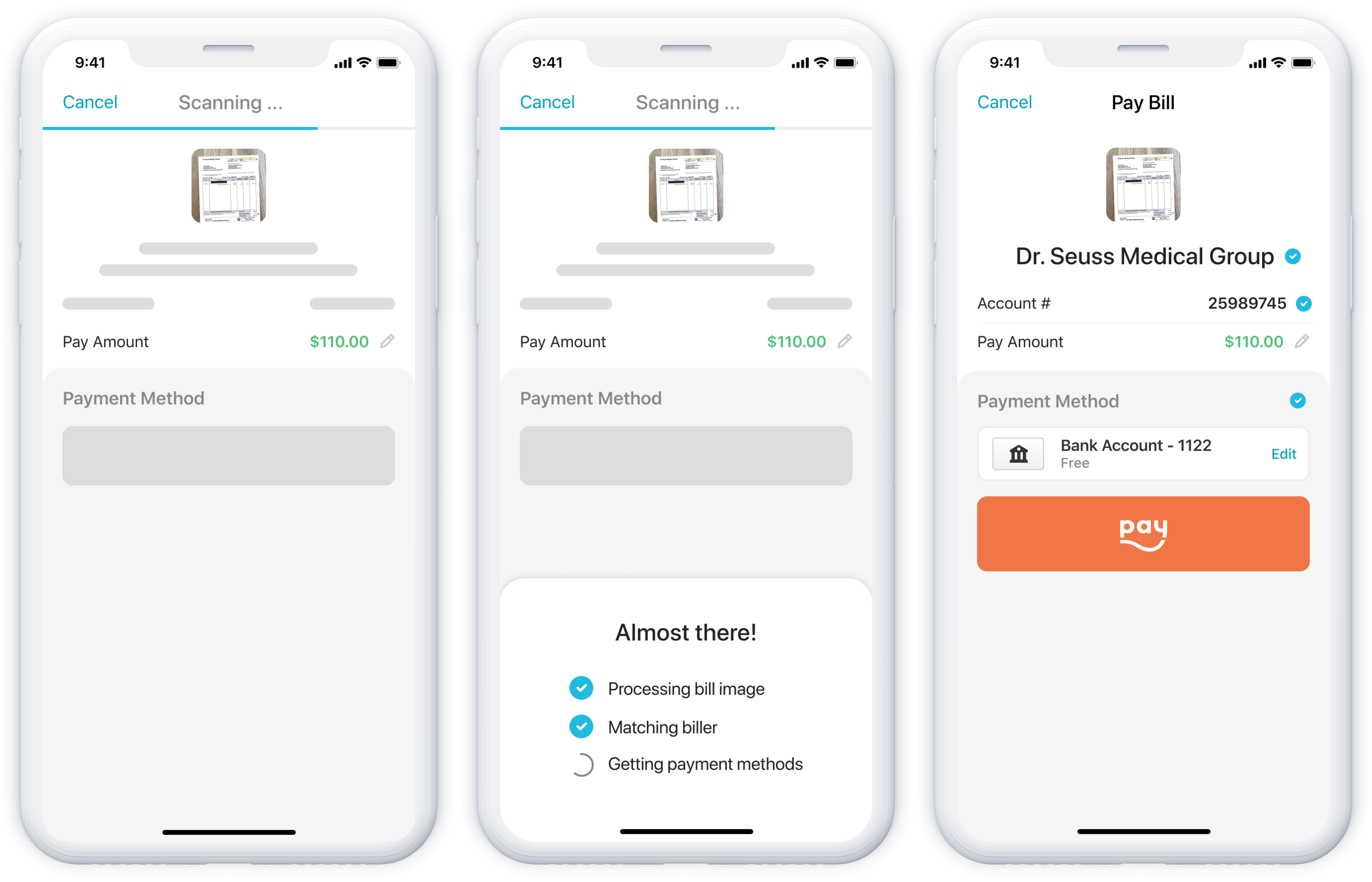
- Skeleton loading: After entering the amount users go to the Pay screen, where we’re using skeleton loading elements to show in context where the results will load in.
- Almost there: While the majority of users won’t see it, I also designed a message that will slide up if the scan is taking extra time. This reassures users that the wait is almost over and reinforces the information being pulled from the bill.
- Results delivery: The most important part of the flow is results delivery. When the OCR results are ready, I used haptic feedback to signify success and get users’ attention. Although we couldn’t load results in one by one as they were ready, I chose to load them in quick succession instead of all at once so users could better process the information. The checkmarks that load in with the results show they were verified by OCR and give another sign that users can trust the process and proceed.
As we prepared for implementation, I worked with the team to break down the design into manageable chunks that we could deliver in a sprint. We prioritized the two transitions that most affected the experience, starting with results delivery. I worked closely with developers to hone the animations and make sure the timing felt right.
The impact of increasing transparency
When we tested the scanning flow against our metrics from before the redesign, there was a 25% in repeat bills paid on the first day a user had our app. This validated that a more transparent scanning design made users more likely to pay repeat bills. It was especially significant that repeat bills on the first day increased, because in many cases it meant users were trusting us with another bill before their first payment had even completed (in prior qualitatives studies, users told us they wanted to wait till their payment completed before trying Papaya again).
Part 2: Improving user understanding of "Pay any bill"
In addition to increasing transparency in the bill pay process, we wanted to help users understand that they could pay any bill with Papaya – even if we didn’t advertise on the biller’s statement. In the past we’d used messaging that very directly told users they could pay any bill, but users still weren’t getting the message. We frequently received questions in user interviews and emails, like “Can Papaya pay my utility bill?”
One idea the PM and I wanted to explore was showing users specific suggestions of other bills they could pay with the Papaya app. Our message of “pay any bill” was failing, but we thought giving them clearer ideas of what to pay could help expand their understanding of Papaya’s scope.
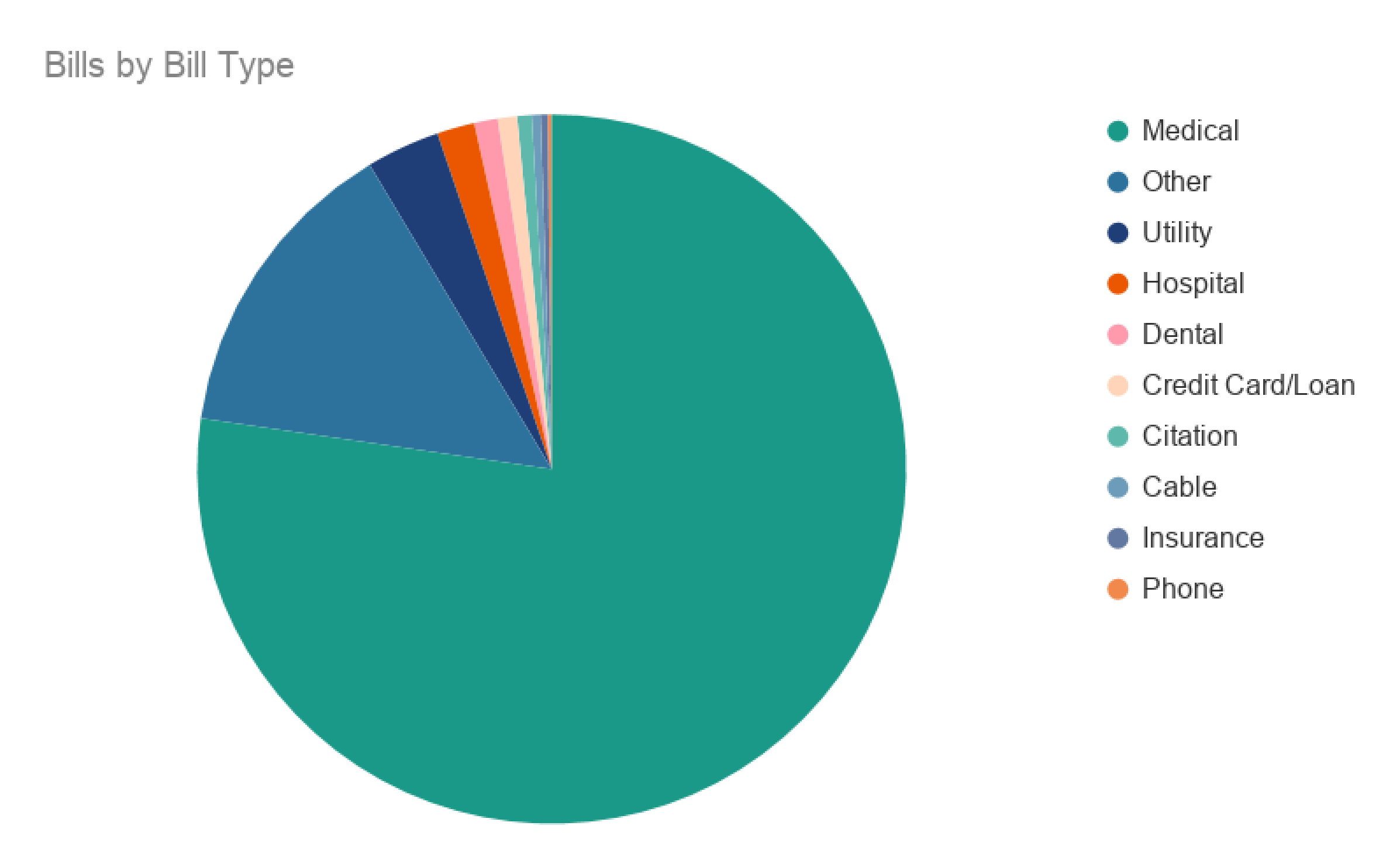
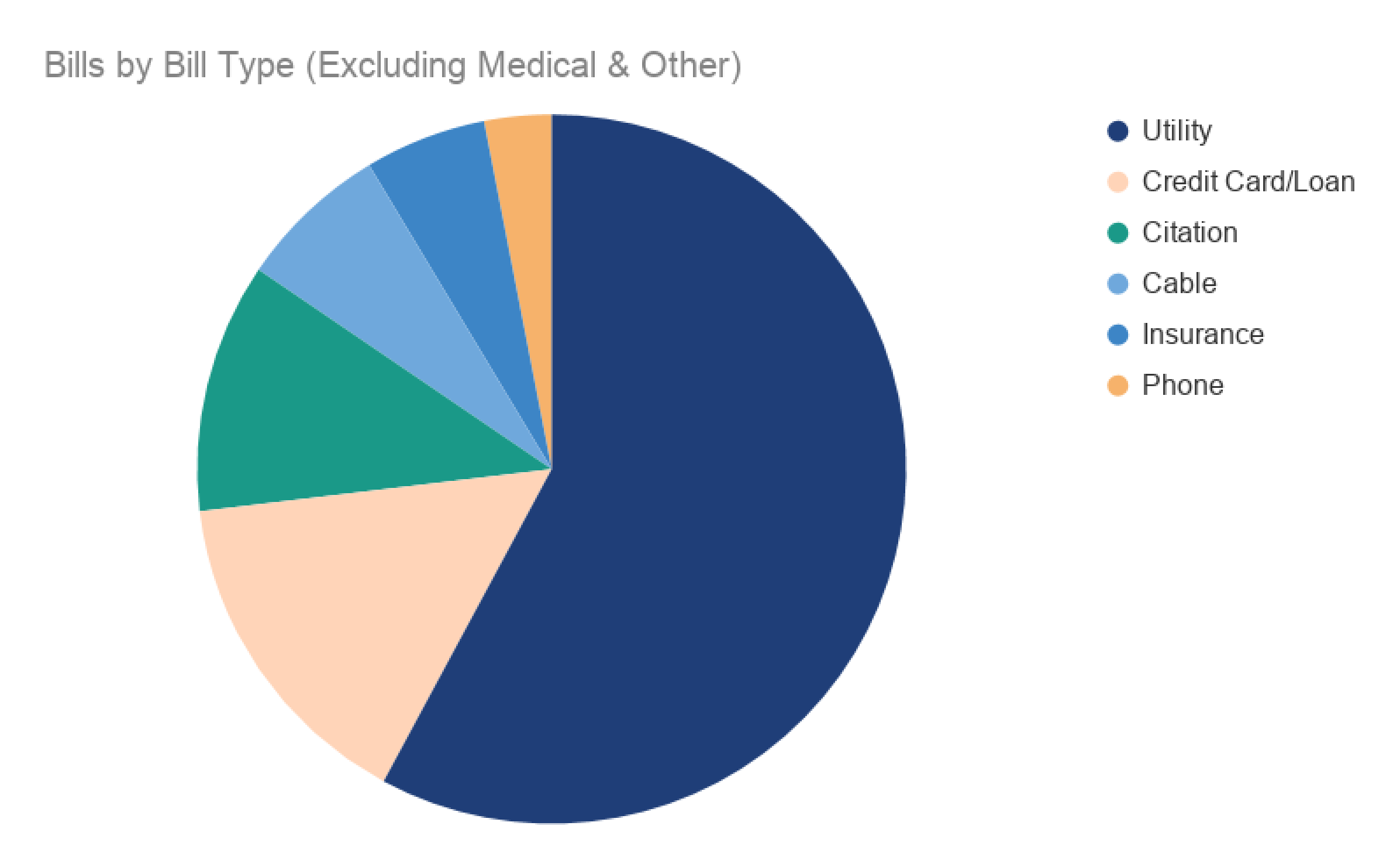
Today, most of the bills paid through Papaya are Medical bills, which makes sense because Papaya partners with a large number of medical practices and billing companies that advertise the app on their bill statements. In discussing the impact of bill suggestions on repeat engagement, we were most interested in focusing on bill types that are recurring (like utilities, phone bills, etc.) since they would drive more repeat bills over time. Taking Medical and Other bill categories out of the data helped us see what other bill types users were paying.
Bill suggestions MVP
The bill suggestions direction felt promising and we knew there would be a lot to iterate on, but we wanted to get a lean MVP out quickly so we could gauge whether the idea was worth pursuing more.
To support the MVP, I designed a modular suggestions card that we could test in various places. The card could handle different content types and stack in different configurations for easy iteration.
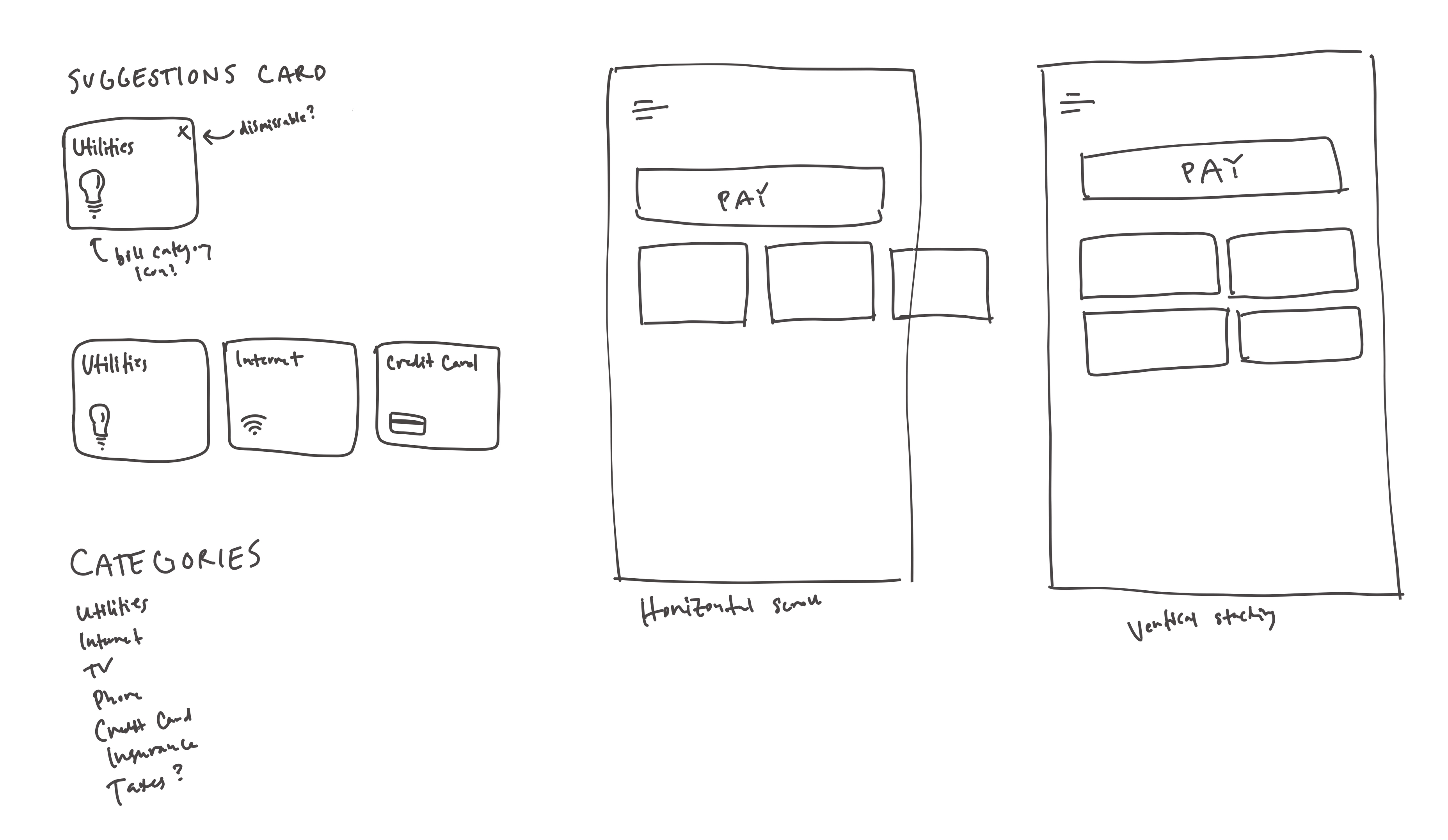
The MVP we released showed bill suggestions in two places:
- After a user successfully submitted their first bill, we showed a list of bill categories they could pay next
- On the home screen of the app, which users see when checking bill status or starting a new payment
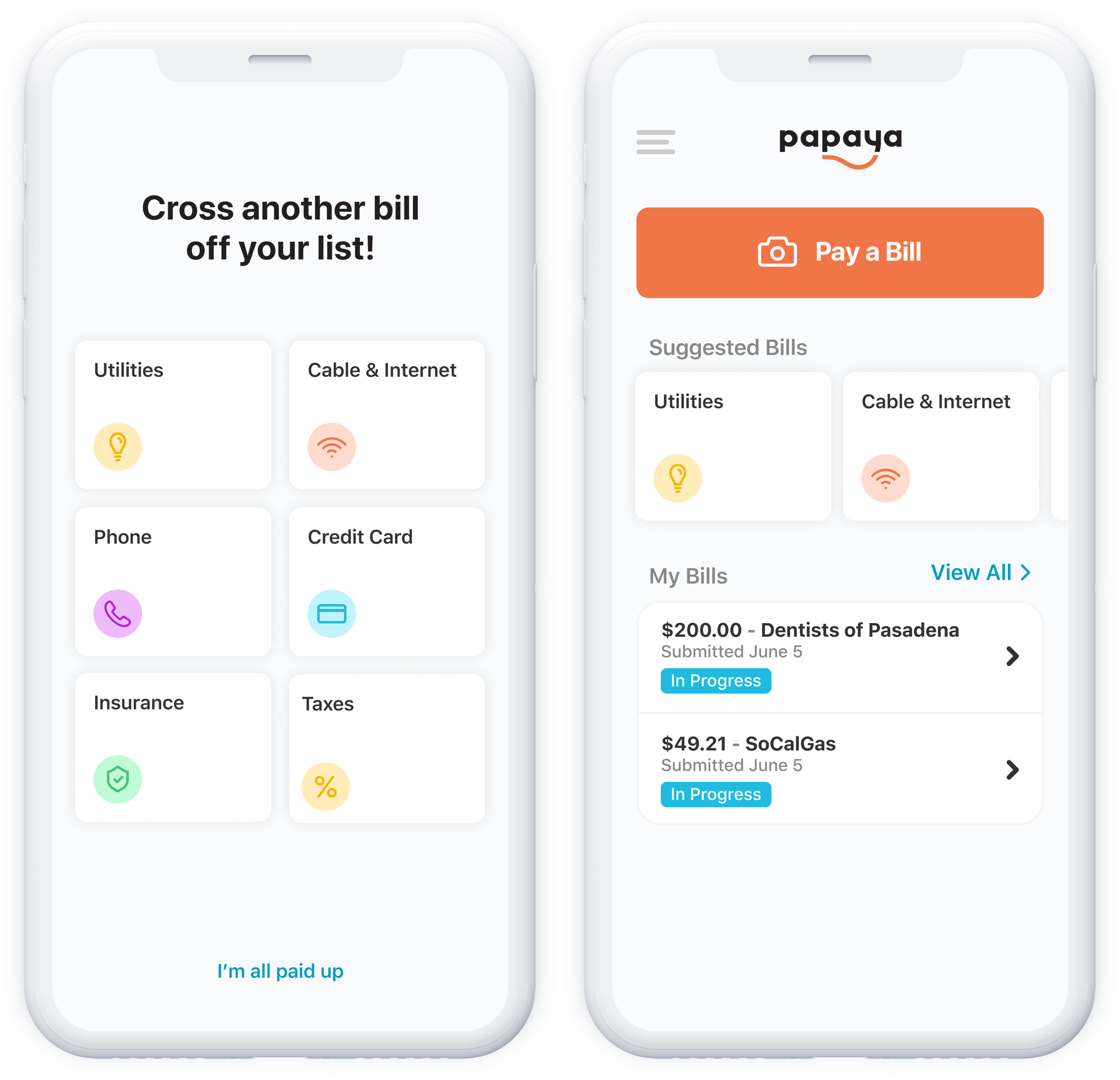
Though it wasn’t significant yet, early data from the MVP gave an indication that users who saw these suggestions were more likely to pay another bill with us.
Personalizing suggestions
We had started with bill category suggestions, which were helpful in getting users to think beyond bills that advertise Papaya, but felt generic. One idea we wanted to test was leveraging data we had about users to make suggestions more personal. There were a few sources of data we could use:
- Zip code – We collect a billing zip code for payment methods, so we have one for most of our users. By matching the zip code to utility providers that serve that area, we could suggest specific utility providers that would likely be a match.
- Plaid data – We use Plaid as an easy way for users to link their bank accounts to Papaya, and through Plaid we get some data about users’ transactions. We could use this data to see if users had paid specific billers from their account and leverage that to suggest those billers in the app.
- Papaya payment history – The last (and most obvious) data we had was a user’s payment history through our app. Although we had been trying to focus on recurring bill types, the reality was that users were mostly paying medical bills. We decided to add a Medical category suggestion to help users understand they could pay other medical providers they might have bills for.
I put the more personalized suggestions into the suggestion cards and prioritized them to show before the generic suggestions in lists when applicable. I also made the personalized suggestions dismissable, so we could tell when suggestions weren’t working for users – if a user dismissed a suggestion, we’d ask them to select a reason, e.g., “I don’t use this biller” or “I’ll pay this bill another way.”
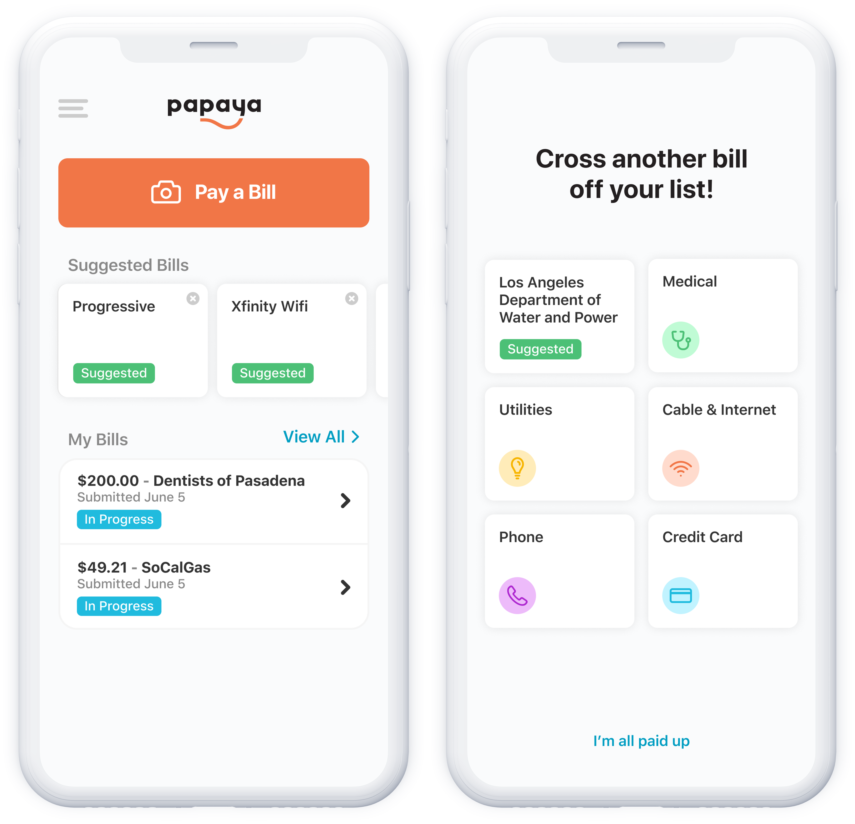
The team implemented the personalized suggestions and we found we got higher conversion when offering a combination of personalized and generic suggestions. Of all the suggestions we offered, we got the biggest boost from adding the “Medical” category, which was our highest engaging suggestion!
Iterating on suggestions
To maximize the value of our suggestions feature, we iterated on other factors, like showing multiple suggestions at once vs. one personalized suggestion, and showing suggestions as a separate section on the home screen vs. embedded in the user’s list of bills.
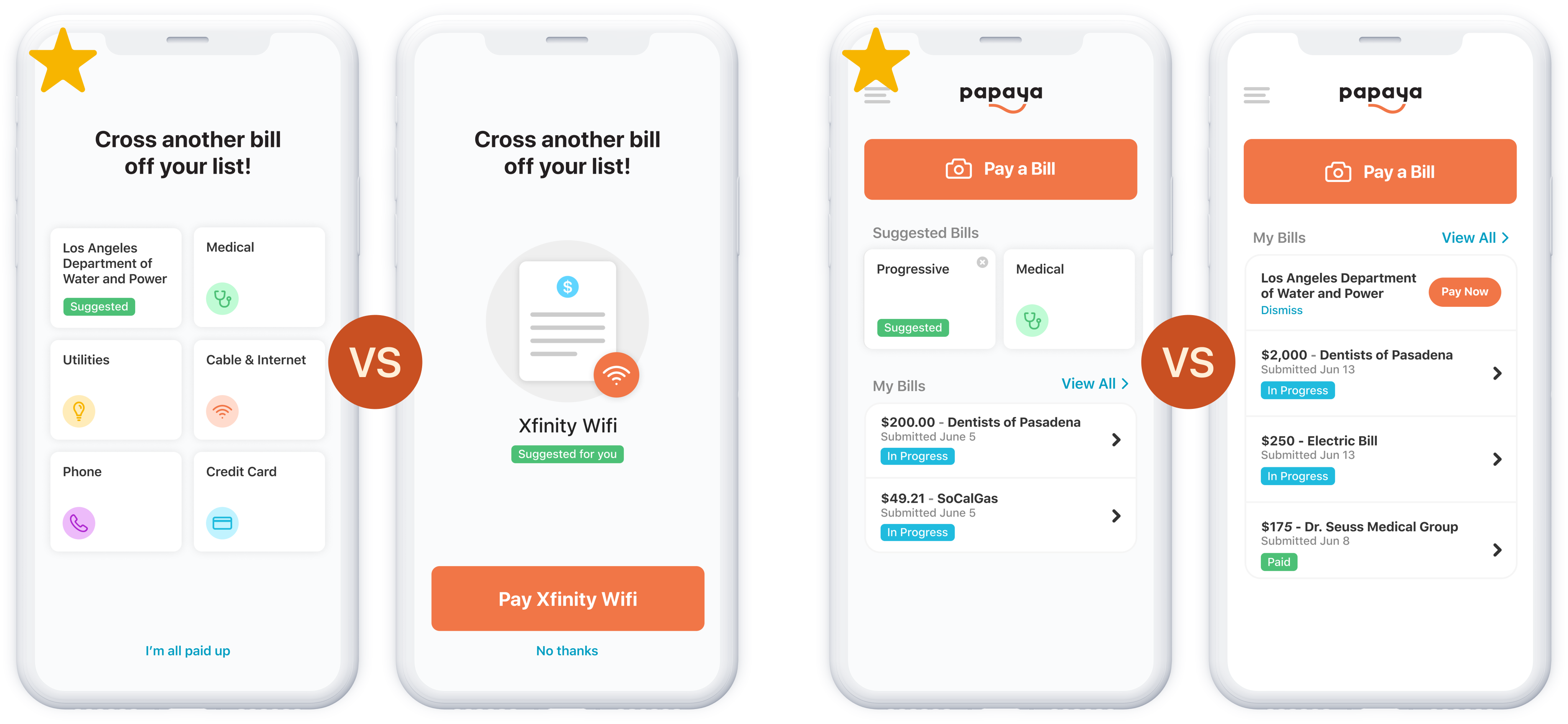
Showing multiple suggestions performed better than one targeted one, and a separate section performed better than embedded suggestions, which surprised me because I thought a more integrated placement might boost conversion.
The impact of bill suggestions
Bill suggestions were a big driver of repeat engagement, increasing the percentage of repeat bills paid in the first 7 days a user has the app by 120%, from 12% to 26%. Perhaps even more importantly, we saw a big increase in the number of repeat bills that were non-partner bills, meaning bills that don’t advertise Papaya on the statement. Repeat bills paid to non-partners increased by 180%.
The takeaway
The combination of increasing transparency in the bill scanning flow and offering suggestions of specific bills and categories to pay made a big impact in the repeat bill engagement rate – one of the metrics that has been hard for Papaya to lift. While there’s more to be done in this area, the improvements were a significant step to growing a more active and engaged user base.

