Laserfiche Forms
Laserfiche Forms
Automating business processes with electronic forms for more dynamic, accessible, and efficient workflows.
Automating business processes with electronic forms for more dynamic, accessible, and efficient workflows.
Laserfiche Forms is an enterprise web application for business process management. It uses digital forms to initiate business processes and a routing engine to automate process flow, creating business processes that are dynamic, accessible, and efficient.
Many organizations in all sectors still rely on paper forms to execute the business processes at the core of their operations. Laserfiche Forms affects organizational change by helping customers go completely paperless with their business processes, increasing flexibility, accountability, and efficiency.
Feature design
Forms was a newly released product when I started at Laserfiche in 2013, and after joining the team I worked on key features that helped mature the product and meet our users’ complex business process automation needs.
I worked closely with the product owner and project manager to align user needs with the business goals of the product and conducted user interviews and competitive analyses to define the product vision and feature scope.
After feature scope and requirements were defined, I collaborated with the UI designer on the team to brainstorm design ideas and create initial sketches of the user flow. After generating a variety of ideas, we presented our strongest ideas to the team, got feedback, iterated on the design, and began creating wireframes, prototypes, and behavioral specifications.
During my time designing for Laserfiche Forms we added many new features to help business process administrators create more robust processes. However, we also added exciting new features that help business processes end users complete their tasks more efficiently and provide key metrics to business process owners.
Inbox
Forms Inbox was aimed at improving the experience of business process end users — people who need to perform a task to keep the process going, like approving a travel request or reviewing a project proposal. These users needed a centralized place to see and perform their business process tasks.
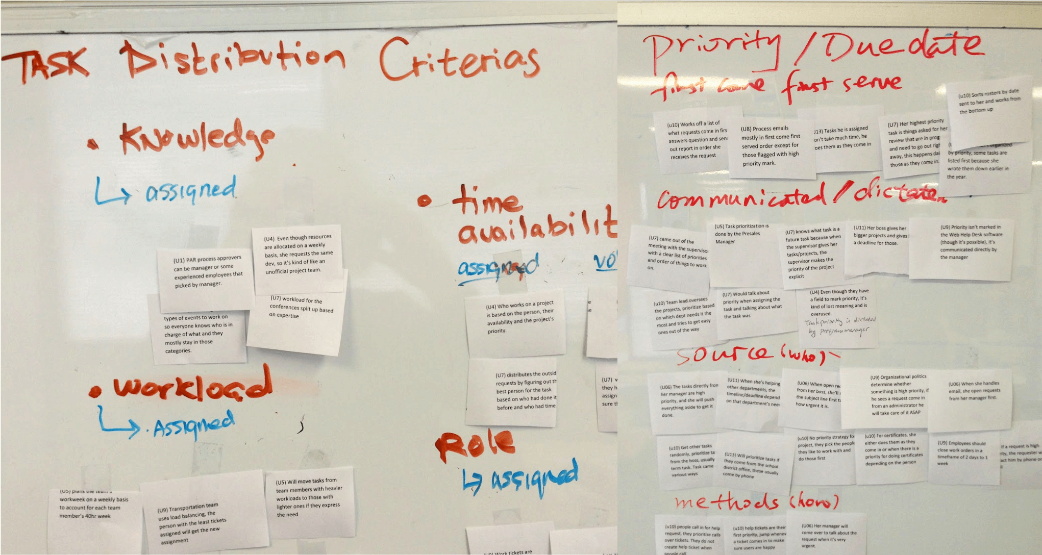
To start the project, I conducted user interviews with internal and external business process participants and led a group of stakeholders in an affinity diagramming exercise. Our main findings were around task priority and distribution, both of which were influenced by a combination of factors and were constantly changing, meaning the Inbox would need to be flexible and accommodating.
It was important for users to be able to peform tasks on the go, so responsive design was a priority and we designed mobile first. We went through many iterations of the design, frequently testing with internal business process participants and external Laserfiche Forms users and incorporating our learnings into the next round.
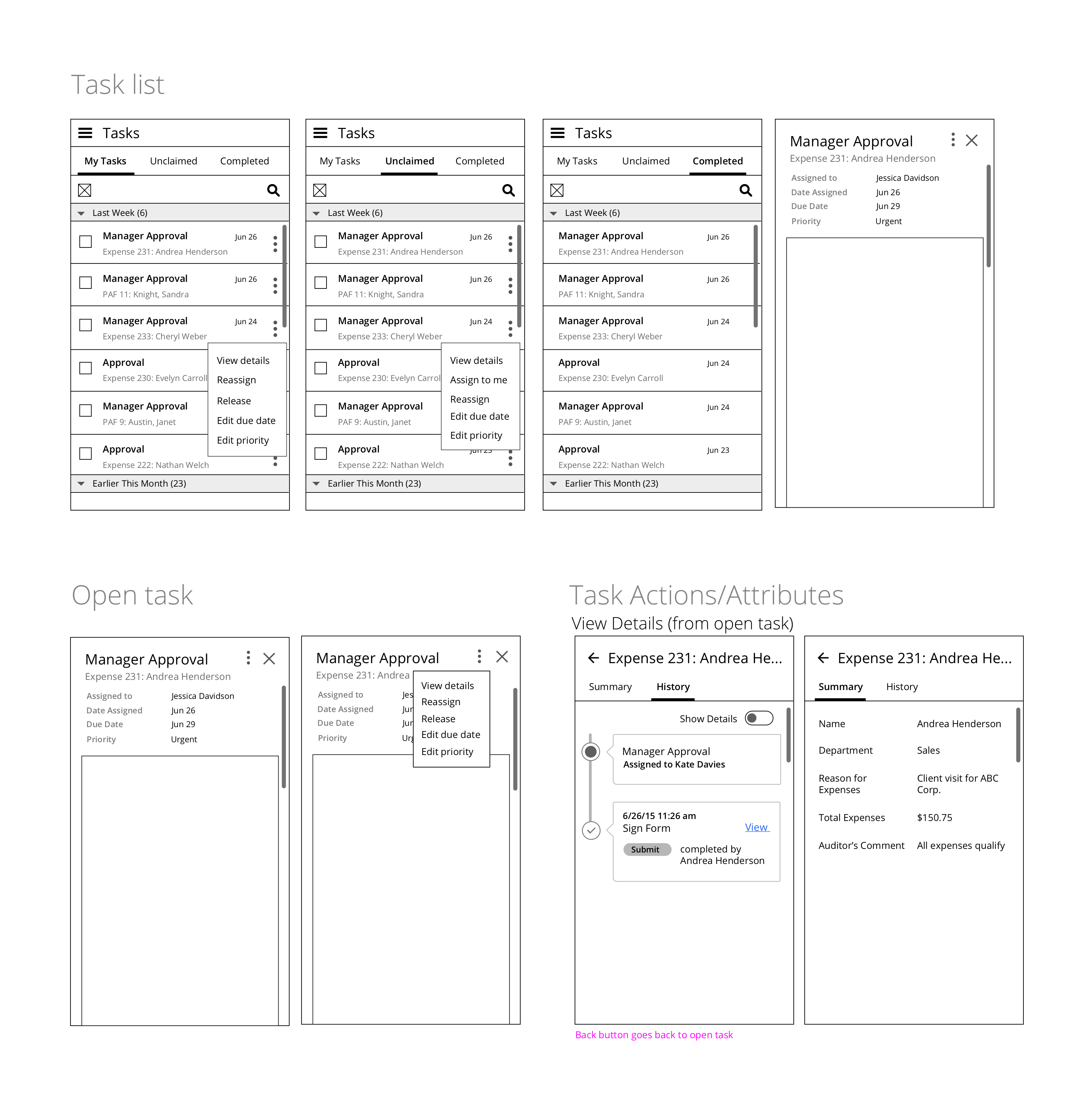
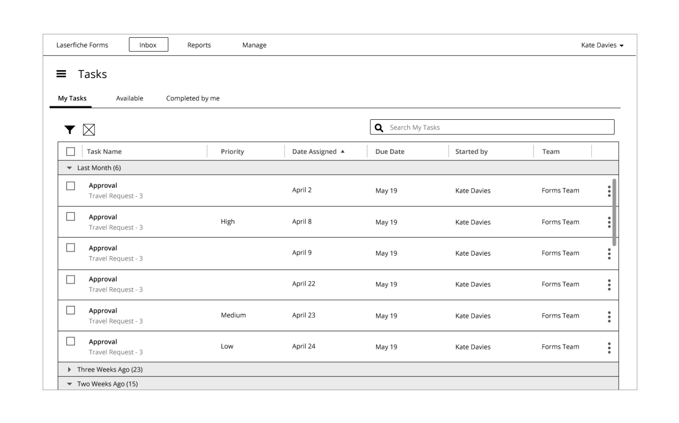
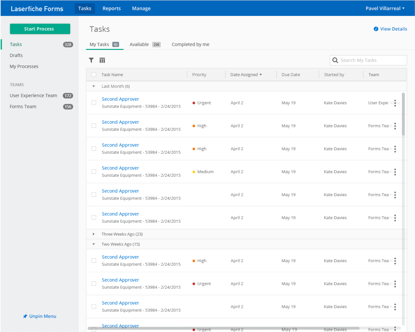
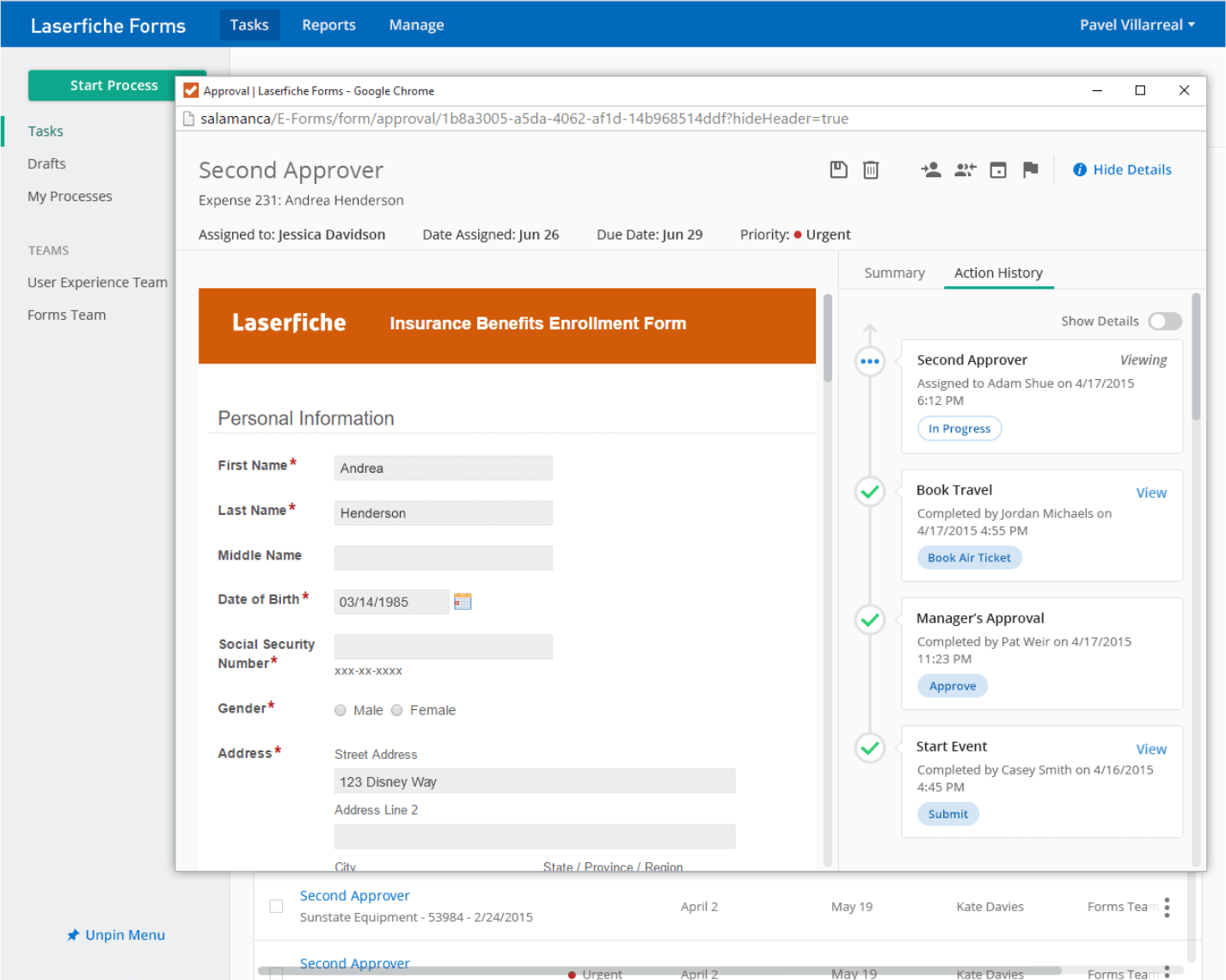
The released inbox included search, sort, and filter controls, so users could reorder tasks quickly, as well as options to change due date, priority, and assignee to keep up with changing priorities. The task view allowed assignees to see all the information they needed to complete a task, including a summary and timeline showing the history of the process instance.
Process reporting
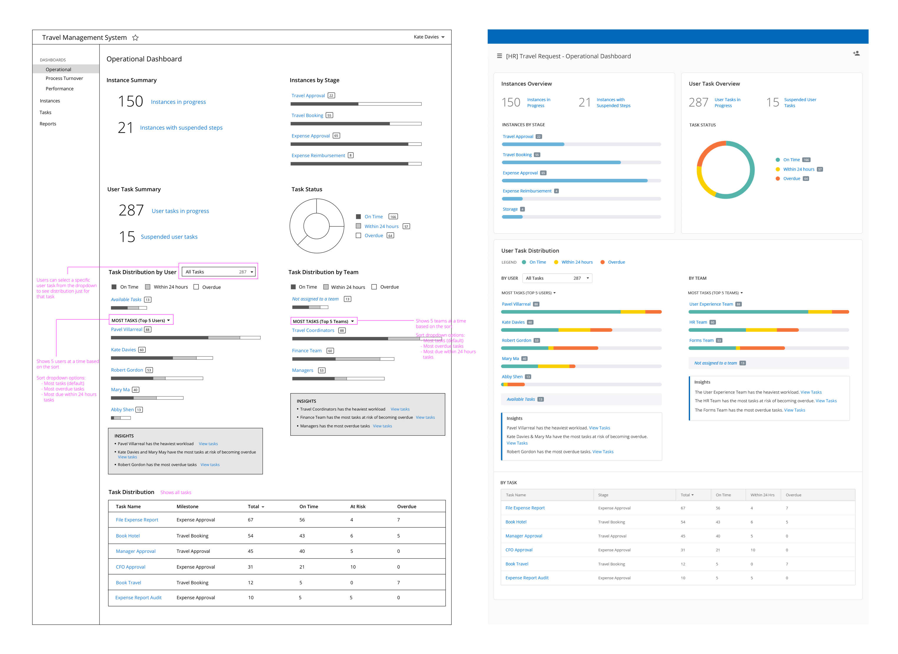
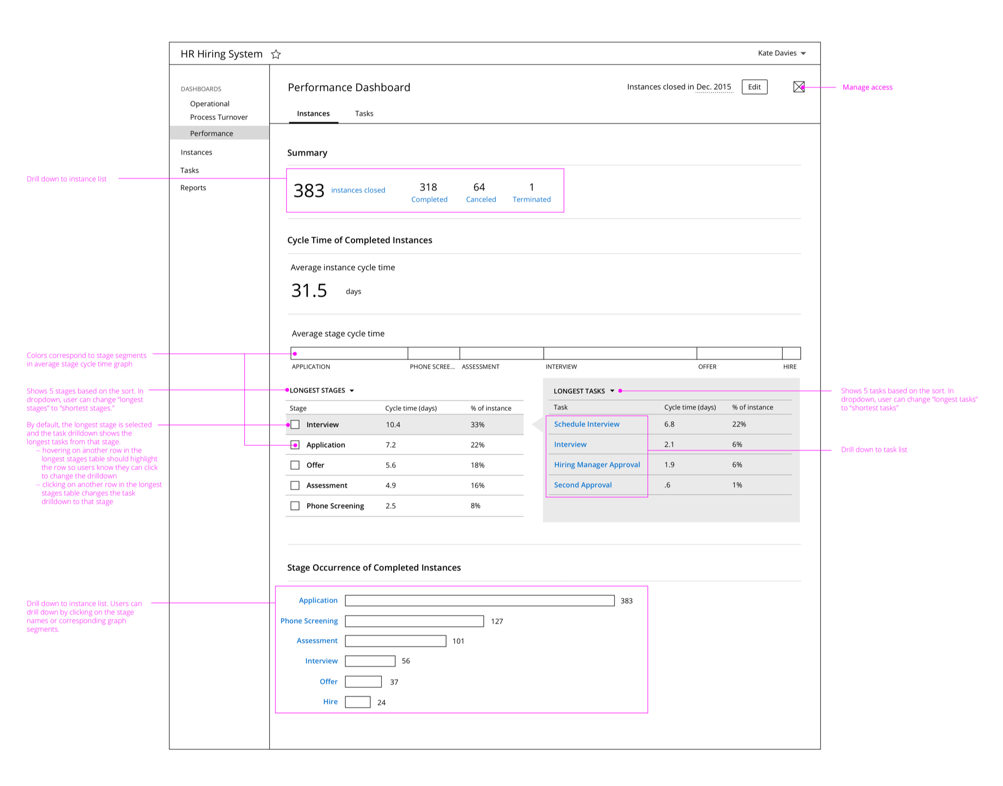
The process reporting feature was designed to help business process owners monitor the health of their processes and improve their efficiency. Based on competitive research and interviews with process owners, we built default dashboards as well as custom reporting features.
The operational dashboard gave a real-time snapshot of the process, allowing process owners to fix bottlenecks by reassigning tasks or reallocating resources as needed.
The performance dashboard provided analytics that allowed process owners to see trends and track process improvements over time.
The process reporting features were very well received when they debuted at our annual user conference.
User research
I planned and executed user research activities throughout the development cycle to ensure Forms features met users’ needs and the UI was intuitive and easy to use. In the formative stages of the design process, I conducted user interviews to identify user needs, attitudes, and behaviors, and used that data to inform the design and development of new features. Later in the design process, I conducted usability testing on prototypes or new features to validate design decisions and identify usability issues for improvement.
When I joined the Forms team, there were no established customer contacts and it was difficult to recruit users for research studies. To make the research process easier and the turnaround time shorter, I established a database of current users that we could contact for research purposes. The effort was very successful, and the increased access to customers made it easier for designers on other product teams to conduct research as well!
Style guide & pattern library
In anticipation of the release of Forms 10, I began assisting the Forms UI designer in creating a style guide and pattern library for the product. After the style guide project was extended to our entire product suite, I worked with other members of the UX team to establish consistent design elements that are now used across all Laserfiche web products. Following many of the principles outlined in Brad Frost’s Atomic Design methodology, I helped conduct an element inventory to identify inconsistencies in the UI, defined pattern usage guidelines that satisfied the needs of the Laserfiche suite, and designed a modern, accessible UI with a professional look and feel.

